- Agents
- Essentials
- Getting Started
- Agent
- API
- APM Tracing
- Containers
- Dashboards
- Database Monitoring
- Datadog
- Datadog Site
- DevSecOps
- Incident Management
- Integrations
- Internal Developer Portal
- Logs
- Monitors
- Notebooks
- OpenTelemetry
- Profiler
- Search
- Session Replay
- Security
- Serverless for AWS Lambda
- Software Delivery
- Synthetic Monitoring and Testing
- Tags
- Workflow Automation
- Learning Center
- Support
- Glossary
- Standard Attributes
- Guides
- Agent
- Integrations
- Extend Datadog
- Authorization
- DogStatsD
- Custom Checks
- Integrations
- Build an Integration with Datadog
- Create an Agent-based Integration
- Create an API-based Integration
- Create a Log Pipeline
- Integration Assets Reference
- Build a Marketplace Offering
- Create an Integration Dashboard
- Create a Monitor Template
- Create a Cloud SIEM Detection Rule
- Install Agent Integration Developer Tool
- Service Checks
- Community
- Guides
- OpenTelemetry
- Administrator's Guide
- API
- Partners
- Datadog Mobile App
- DDSQL Reference
- CoScreen
- CoTerm
- Remote Configuration
- Cloudcraft (Standalone)
- In The App
- Dashboards
- Notebooks
- DDSQL Editor
- Reference Tables
- Sheets
- Monitors and Alerting
- Service Level Objectives
- Metrics
- Watchdog
- Bits AI
- Internal Developer Portal
- Error Tracking
- Change Tracking
- Event Management
- Incident Response
- Actions & Remediations
- Infrastructure
- Cloudcraft
- Resource Catalog
- Universal Service Monitoring
- End User Device Monitoring
- Hosts
- Containers
- Processes
- Serverless
- Network Monitoring
- Storage Management
- Cloud Cost
- Application Performance
- APM
- Continuous Profiler
- Database Monitoring
- Agent Integration Overhead
- Setup Architectures
- Setting Up Postgres
- Setting Up MySQL
- Setting Up SQL Server
- Setting Up Oracle
- Setting Up Amazon DocumentDB
- Setting Up MongoDB
- Setting Up ClickHouse
- Connecting DBM and Traces
- Data Collected
- Exploring Database Hosts
- Exploring Query Metrics
- Exploring Query Samples
- Exploring Database Schemas
- Exploring Recommendations
- Troubleshooting
- Guides
- Data Streams Monitoring
- Data Observability
- Digital Experience
- Real User Monitoring
- Synthetic Testing and Monitoring
- Continuous Testing
- Experiments
- Product Analytics
- Session Replay
- Software Delivery
- CI Visibility
- CD Visibility
- Deployment Gates
- Test Optimization
- Code Coverage
- PR Gates
- DORA Metrics
- Feature Flags
- Developer Integrations
- Security
- Security Overview
- Cloud SIEM
- Code Security
- Cloud Security
- App and API Protection
- AI Guard
- Workload Protection
- Sensitive Data Scanner
- AI Observability
- Log Management
- Observability Pipelines
- Configuration
- Sources
- Processors
- Destinations
- Amazon OpenSearch
- Amazon S3
- Amazon Security Lake
- Azure Storage
- CrowdStrike NG-SIEM
- Datadog Archives
- Datadog CloudPrem
- Datadog Logs
- Datadog Metrics
- Elasticsearch
- Google Cloud Storage
- Google Pub/Sub
- Google SecOps
- HTTP Client
- Kafka
- Microsoft Sentinel
- New Relic
- OpenSearch
- SentinelOne
- Socket
- Splunk HEC
- Sumo Logic Hosted Collector
- Syslog
- Packs
- Akamai CDN
- Amazon CloudFront
- Amazon VPC Flow Logs
- AWS Application Load Balancer Logs
- AWS CloudTrail
- AWS Elastic Load Balancer Logs
- AWS Network Load Balancer Logs
- Cisco ASA
- Cloudflare
- F5
- Fastly
- Fortinet Firewall
- HAProxy Ingress
- Istio Proxy
- Juniper SRX Firewall Traffic Logs
- Netskope
- NGINX
- Okta
- Palo Alto Firewall
- Windows XML
- ZScaler ZIA DNS
- Zscaler ZIA Firewall
- Zscaler ZIA Tunnel
- Zscaler ZIA Web Logs
- Search Syntax
- Scaling and Performance
- Monitoring and Troubleshooting
- Guides and Resources
- Log Management
- CloudPrem
- Administration
Create a Dashboard to track and correlate APM metrics
4 minutes to complete
Datadog APM allows you to create dashboards based on your business priorities and metrics important to you: You can create widgets on these dashboards to keep track of any traditional infrastructure, logs and custom metrics like host memory usage alongside critical APM metrics based on throughput, latency, and error rate for correlation. Next to these you can track latency of the user experience of your top customers or largest transactions and alongside these keep track of the throughput of your main web server ahead of any major events like Black Friday.
This guides walks you through adding trace metrics to a dashboard, correlating them with infrastructure metrics and then how to export an Analytics query. This guide covers adding widgets to the dashboard in three ways:
- Copying an existing APM graph ( Step 1. 2. & 3.)
- Creating it manually. (Step 4. & 5. )
- Exporting an Analytics query. (Step 7.)
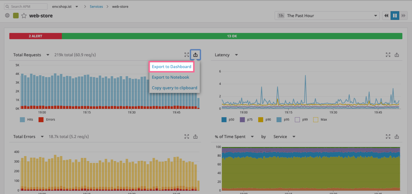
Open the Software Catalog and choose the
web-storeservice.Find the Total Requests Graph and click on the
exportbutton on the top right to chooseExport to Dashboard. ClickNew Timeboard.Click on
View Dashboardin the success message.In the new dashboard, the
Hit/error count on servicegraph for theweb-storeservice is now available. It shows the entire throughput of this service as well as its total amount of errors.Note: You can click on the pencil icon to edit this graph and see what precise metrics are being used.
Click on the
Add graphplaceholder tile on the dashboard space and then Drag aTimeseriesto this space.This is the dashboard widget edit screen. It empowers you to create any type of visualization across all of the metrics available to you. See the Timeseries widget documentation to learn more.
Click on the
system.cpu.userbox and choose the metric and parameters relevant to you, in this example:Parameter Value Description metrictrace.rack.requests.errorsThe Ruby Rack total set of erroneous requests. fromservice:web-storeThe main service in this example stack, it is a Ruby service and all the information in the chart with come from it. sum byhttp.status_codeBreaking down the chart by http status codes. This specific breakdown is just one example of the many can choose. It is important to note that any metric that starts with
trace.contains APM information. See the APM metric documentation to learn more.Drag another timeseries to the placeholder tile
In this example two different types of metrics are added to a graph, a
trace.*and aruntime.*one. Combined, these metrics allow you to correlate information between requests and code runtime performances. Specifically, the latency of a service is displayed next to the thread count, knowing that latency spikes might be associated with an increase in the thread count:First, add
trace.rack.requests.errorsmetric into the widget:Parameter Value Description metrictrace.rack.request.duration.by.service.99pThe 99th percentile of latency of requests in our service. fromservice:web-storeThe main service in this example stack, it is a Ruby service and all the information in the chart with come from it. Then click on the
Graph additional: Metricsto add another metric to the chart:Parameter Value Description metricruntime.ruby.thread_countThread count taken from the Ruby runtime metrics. fromservice:web-storeThe main service in this example stack, it is a Ruby service and all the information in the chart with come from it.
This setup can show whether a spike in latency is associated with a spike in the ruby thread count, immediately pointing out the cause for latency allowing for fast resolution.
Go to Analytics.
This example shows how to query the latency across the example application: breaking it down by merchants on the platform and view the top-10 merchants with highest latency. From the Analytics screen, export the graph to the dashboard and view it there:
Return to your dashboard.
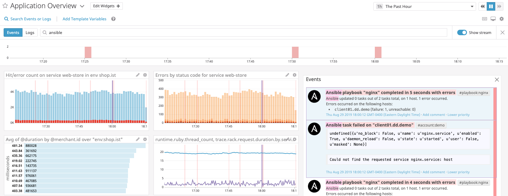
Multiple widgets can now be seen providing deep observability into the example application from both a technical perspective and a business one. But this is only the start of what you can do: add infrastructure metrics, use multiple types of visualizations and add calculations and projections.
With the dashboard you can also explore related events.
Click on the
Search Events or Logsbutton and add search for a relevant event explorer. Note: in this example Ansible is used, your event explorer might be different.Here, alongside the view of our dashboard, recent events that have happened (in datadog or in external services like Ansible, Chef, etc.) can be seen such as: deployments, task completions, or monitors alerting. These events can then be correlated to what is happening to the metrics setup in the dashboard.
Finally, make sure to use template variables. These are a set of values that dynamically control the widgets on the dashboards that every user can use without having to edit the widgets themselves. For more information, see the Template Variable documentation.
Click on Add Variable in the header. Choose the tag that the variable will control, and configure its name, default value, or available values.
In this example a template variable for
Regionis added to see how the dashboard behaves acrossus-east1andeurope-west-4, out two primary areas of operation.You can now add this template variable to each of the graphs:
When you select template variable values, all values update in the applicable widgets of the dashboard.
Be sure to explore all the metrics available to you and take full advantage of the Datadog 3 pillars of observability. You can turn this basic dashboard into a powerful tool that is a one-stop-shop for monitoring and observability in your organization.
Further Reading
Additional helpful documentation, links, and articles:


