- Agents
- Essentials
- Getting Started
- Agent
- API
- APM Tracing
- Containers
- Dashboards
- Database Monitoring
- Datadog
- Datadog Site
- DevSecOps
- Incident Management
- Integrations
- Internal Developer Portal
- Logs
- Monitors
- Notebooks
- OpenTelemetry
- Profiler
- Search
- Session Replay
- Security
- Serverless for AWS Lambda
- Software Delivery
- Synthetic Monitoring and Testing
- Tags
- Workflow Automation
- Learning Center
- Support
- Glossary
- Standard Attributes
- Guides
- Agent
- Integrations
- Extend Datadog
- Authorization
- DogStatsD
- Custom Checks
- Integrations
- Build an Integration with Datadog
- Create an Agent-based Integration
- Create an API-based Integration
- Create a Log Pipeline
- Integration Assets Reference
- Build a Marketplace Offering
- Create an Integration Dashboard
- Create a Monitor Template
- Create a Cloud SIEM Detection Rule
- Install Agent Integration Developer Tool
- Service Checks
- Community
- Guides
- OpenTelemetry
- Administrator's Guide
- API
- Partners
- Datadog Mobile App
- DDSQL Reference
- CoScreen
- CoTerm
- Remote Configuration
- Cloudcraft (Standalone)
- In The App
- Dashboards
- Notebooks
- DDSQL Editor
- Reference Tables
- Sheets
- Monitors and Alerting
- Service Level Objectives
- Metrics
- Watchdog
- Bits AI
- Internal Developer Portal
- Error Tracking
- Change Tracking
- Event Management
- Incident Response
- Actions & Remediations
- Infrastructure
- Cloudcraft
- Resource Catalog
- Universal Service Monitoring
- End User Device Monitoring
- Hosts
- Containers
- Processes
- Serverless
- Network Monitoring
- Storage Management
- Cloud Cost
- Application Performance
- APM
- Continuous Profiler
- Database Monitoring
- Agent Integration Overhead
- Setup Architectures
- Setting Up Postgres
- Setting Up MySQL
- Setting Up SQL Server
- Setting Up Oracle
- Setting Up Amazon DocumentDB
- Setting Up MongoDB
- Setting Up ClickHouse
- Connecting DBM and Traces
- Data Collected
- Exploring Database Hosts
- Exploring Query Metrics
- Exploring Query Samples
- Exploring Database Schemas
- Exploring Recommendations
- Troubleshooting
- Guides
- Data Streams Monitoring
- Data Observability
- Digital Experience
- Real User Monitoring
- Synthetic Testing and Monitoring
- Continuous Testing
- Experiments
- Product Analytics
- Session Replay
- Software Delivery
- CI Visibility
- CD Visibility
- Deployment Gates
- Test Optimization
- Code Coverage
- PR Gates
- DORA Metrics
- Feature Flags
- Developer Integrations
- Security
- Security Overview
- Cloud SIEM
- Code Security
- Cloud Security
- App and API Protection
- AI Guard
- Workload Protection
- Sensitive Data Scanner
- AI Observability
- Log Management
- Observability Pipelines
- Configuration
- Sources
- Processors
- Destinations
- Packs
- Akamai CDN
- Amazon CloudFront
- Amazon VPC Flow Logs
- AWS Application Load Balancer Logs
- AWS CloudTrail
- AWS Elastic Load Balancer Logs
- AWS Network Load Balancer Logs
- Cisco ASA
- Cloudflare
- F5
- Fastly
- Fortinet Firewall
- HAProxy Ingress
- Istio Proxy
- Juniper SRX Firewall Traffic Logs
- Netskope
- NGINX
- Okta
- Palo Alto Firewall
- Windows XML
- ZScaler ZIA DNS
- Zscaler ZIA Firewall
- Zscaler ZIA Tunnel
- Zscaler ZIA Web Logs
- Search Syntax
- Scaling and Performance
- Monitoring and Troubleshooting
- Guides and Resources
- Log Management
- CloudPrem
- Administration
Visualize
Overview
Visualizations define the outcomes of the filters and aggregates displayed in the RUM Explorer. Select the relevant visualization type to surface the information you need under the search query.
Lists
Lists are paginated results of events and are ideal when individual results matter. You do not need prior knowledge of what defines a matching result to use lists.
The information you search for is displayed in columns. You can manage the following:
- The table with available interactions on the first row. You can sort, rearrange, and remove columns.
- The facet panel on the left or the RUM event side panel on the right. You can add a column for a field.
By default, RUM events in the list visualization are organized by timestamp, with the most recent events listed first. You can sort events in any way you want, such as with facets. Surface RUM events with the lowest or highest value for a measure first, then sort your events lexicographically for the unique value of a facet. This orders a column according to the facet.
While you can add attributes and tags in columns, Datadog recommends sorting the table if you have declared a facet first. To see the value of a custom attribute for a line item on the table, you can add non-faceted attributes in the columns, but they may not sort correctly.
The RUM events table configuration is stored with additional elements of your troubleshooting context in Saved Views.
List widget
The List Widget on dashboards shows individual events for a given data source, including RUM data. You can use the list widget to view any RUM events on a dashboard, like all errors on a particular page for example.
In addition to dashboards, the list widget can be used in Notebooks as well, allowing you to add RUM events as part of reports and investigations.
Timeseries
Visualize the evolution of a single measure (or a facet unique count of values) over a selected time frame, and optionally, split by an available facet.
The timeseries graph depicts the evolution of the number of pageviews on the Shopist application over the past day for every view path.
You can choose additional display options such as:
- Display: Results are shown as bars (recommended for counts and unique counts), lines (recommended for statistical aggregations), areas, and several color sets are available.
- The roll-up interval: Determines the width of buckets in the bars.
Top list
Visualize the top values from a facet based on your chosen measure.
The top list includes the top browsers used to visit the Shopist website over the last day.
Nested tables
Visualize the top values from up to three facets according to your chosen measure (the first measure you choose in the list) and display the value of additional measures for elements that appear in the nested table. Update the search query or investigate the RUM events corresponding to either dimension.
- When there are multiple measures, the top or bottom list is determined according to the first measure.
- The subtotal may differ from the actual sum of values in a group since only a subset (top or bottom) is displayed. Events with a null or empty value for this dimension are not displayed as a sub-group.
Note: A table visualization used for one single measure and one single dimension is the same as a top list, just with a different display.
The following RUM Analytics table shows the top 5 URL paths for two countries, US and Japan, grouped by browser, over the last day:
Distributions
You can display the distribution of measure attributes over the selected time frame to see the values fluctuate.
The distribution graph displays the distribution of the Largest Contentful Paint that measures the user experience of the Shopist landing page.
Geomaps
Visualize a single measure (or a facet unique count of values) on the world map.
The RUM Analytics geomap shows the 75th percentile of the Largest Contentful Paint over the past day.
Funnels
Funnel analysis helps you track conversion rates across key workflows to identify and address any bottlenecks in end-to-end user journeys. Specifically, you can:
- See if customers drop off at a certain point due to poor website performance
- Track how the conversion rate changes over time as new features are built
- Measure how adding new steps to a workflow impacts drop off rate
Note: The conversion rate is the number of visitors to your website that completed a desired goal (a conversion) out of the total number of visitors.
Build a funnel
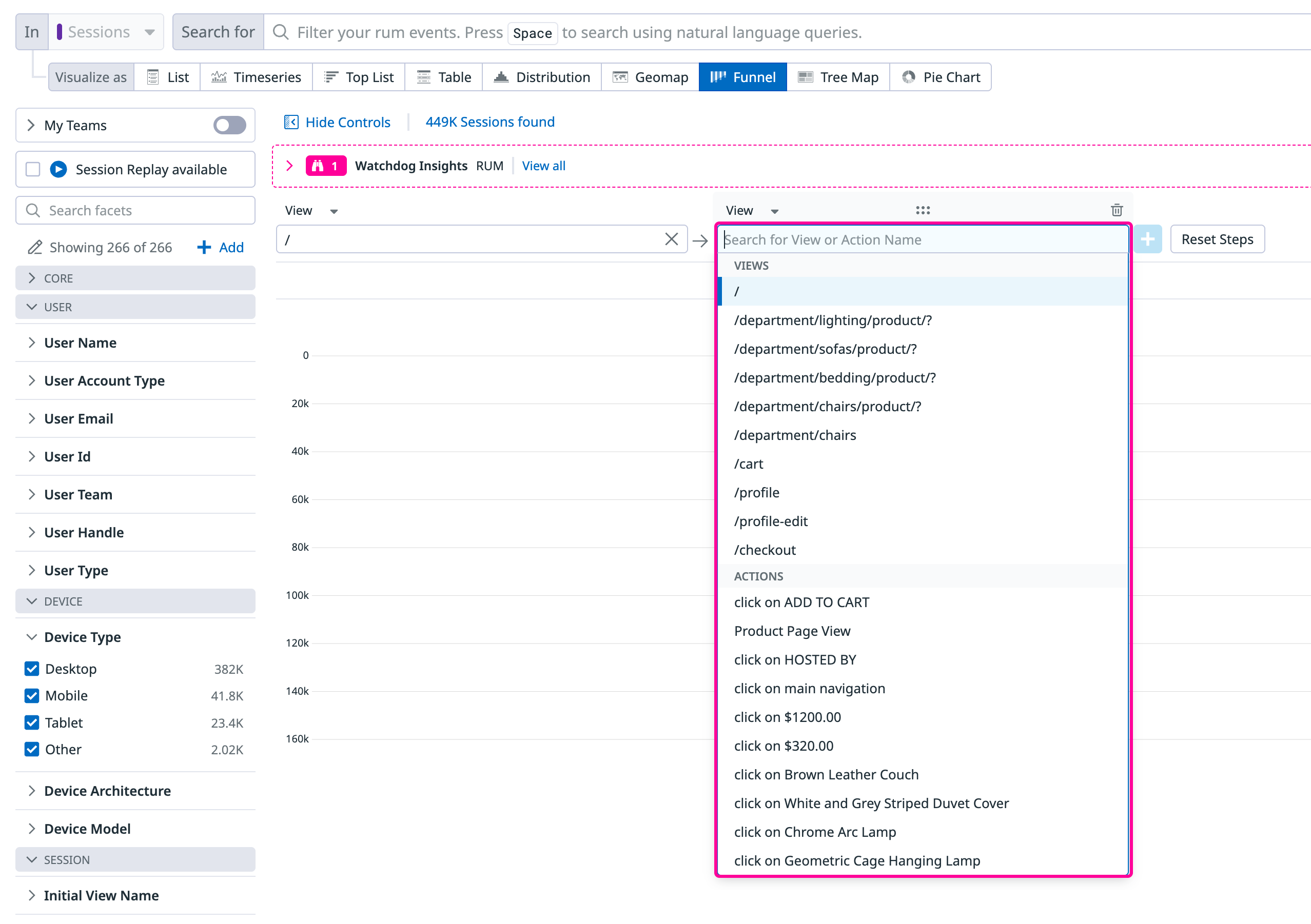
To build a funnel, choose your starting view or action and click on the plus icon to build additional steps. You can also use drag and drop functionality to move steps around.
Suggested next steps
When you have a starting point in mind, but aren’t sure what your users did next, click the search input box where it says “Search for View or Action Name” to view suggested next steps. This input box automatically loads the top most common views and actions that users typically see and take next. This allows you to build funnels quicker knowing the paths your users are taking in sequence.
Note: Any action or view that happens between two steps in a funnel does not impact the step-by-step or overall conversion rate. As long as step 1 and step 2 happen in the right order in a given session at least once, it counts as a single converted session.
Filtering
When constructing your funnel, you can add default attributes (core, device, operating system, geo-location, and user) and session-specific attributes to analyze the data further. Click the Add Filter button to view the full list of available attributes.
Analyze your funnel
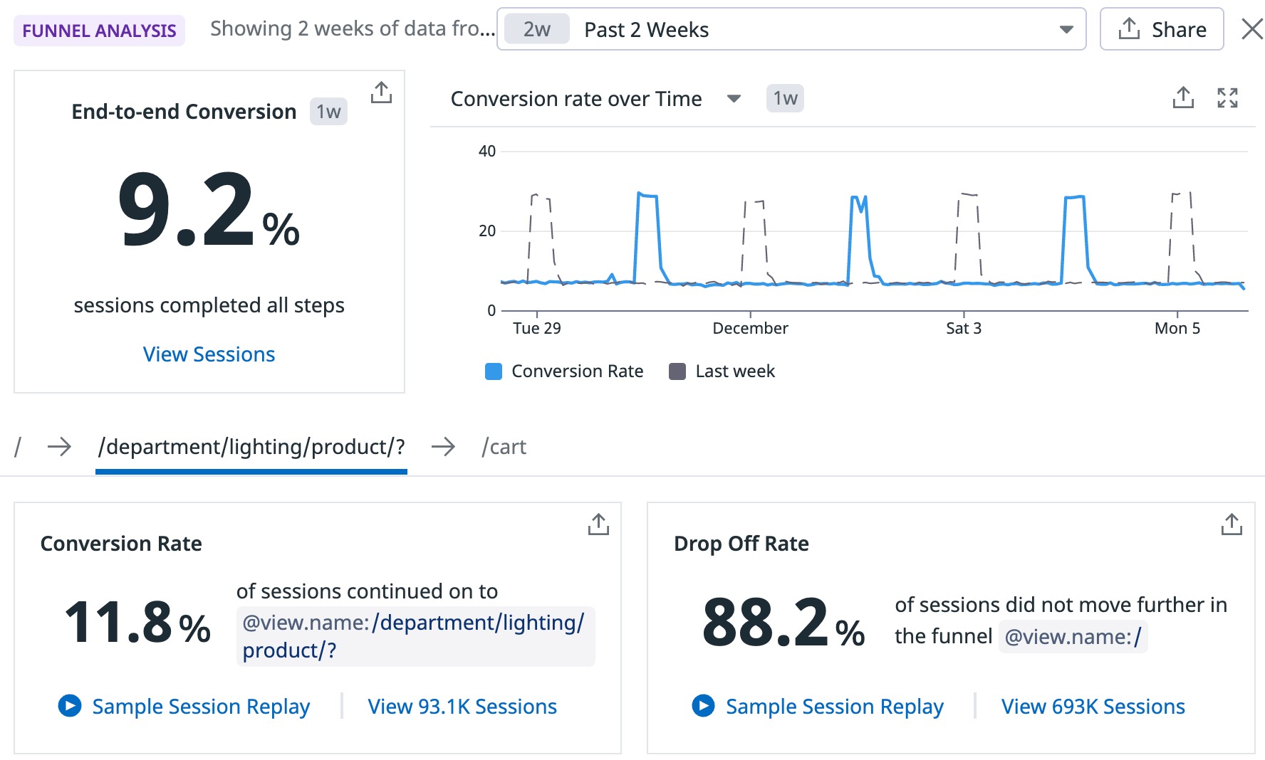
After you build a funnel, click on View Funnel Insights to open the Funnel Analysis panel, which offers correlated data on performance and user behavior trends. This information helps you understand the conversion rate.
For high level trends, you can see the end-to-end conversion rate for your entire workflow and also see individual steps to step conversion to dropoff rates. If you want to understand what it looks like for someone who converted versus someone who dropped off, you can watch a Session Replay for each case.
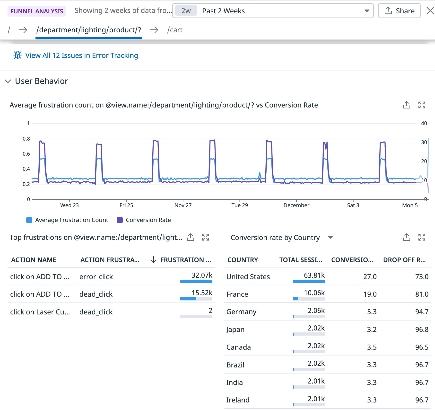
The Performance section allows you to understand if poor performance could have affected conversion. You can view a graph with a correlation between the load time of that page and the conversion rate and also see if any issues (detected by Error Tracking) occurred on that page.
The User Behavior section allows you to compare the average frustration count (from frustration signals) with the conversion rate, and further analyze the frustration signals detected from individual actions. Next to this section is a chart showing the conversion and drop off rate for specific countries, allowing you to understand if geographic region plays a role in a user converting.
Pie charts
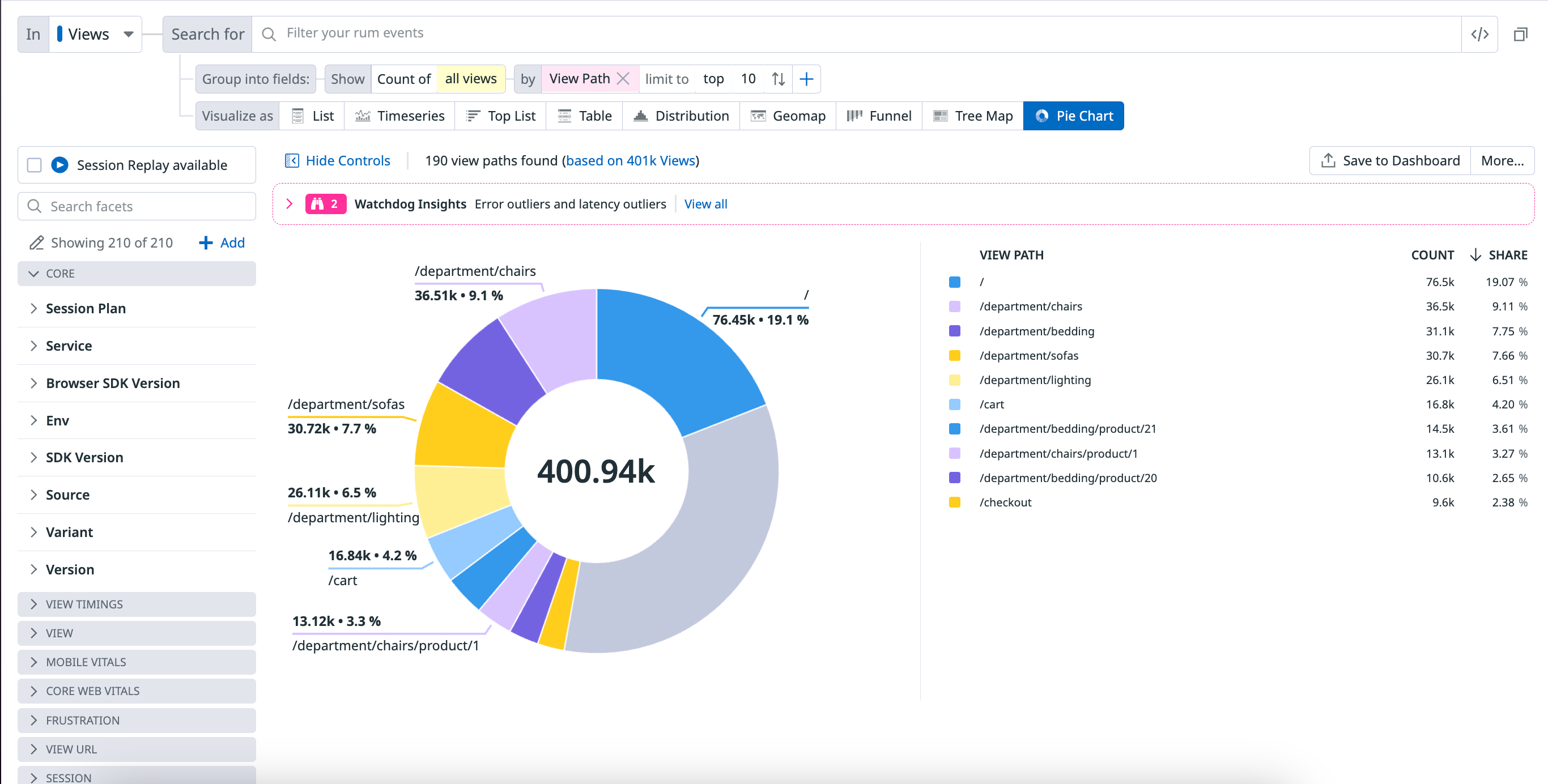
A pie chart helps you organize and show data as a percentage of a whole. It is useful when comparing the relationship between different dimensions such as services, users, hosts, countries, etc. within your log data.
The following pie chart shows the percentage breakdown by View Path.
Related events
For all visualizations, select a section of the graph or click on the graph to either zoom in or see a list of events that correspond to your selection.
For the remaining visualization options, click on the graph and click View events to see a list of events that correspond to your selection.
Further Reading
Additional helpful documentation, links, and articles:


