- 重要な情報
- はじめに
- 用語集
- Standard Attributes
- ガイド
- インテグレーション
- エージェント
- OpenTelemetry
- 開発者
- Administrator's Guide
- API
- Partners
- DDSQL Reference
- モバイルアプリケーション
- CoScreen
- CoTerm
- Remote Configuration
- Cloudcraft
- アプリ内
- ダッシュボード
- ノートブック
- DDSQL Editor
- Reference Tables
- Sheets
- Watchdog
- アラート設定
- メトリクス
- Bits AI
- Internal Developer Portal
- Error Tracking
- Change Tracking
- Service Management
- Actions & Remediations
- インフラストラクチャー
- Cloudcraft
- Resource Catalog
- ユニバーサル サービス モニタリング
- Hosts
- コンテナ
- Processes
- サーバーレス
- ネットワークモニタリング
- Cloud Cost
- アプリケーションパフォーマンス
- APM
- Continuous Profiler
- データベース モニタリング
- Data Streams Monitoring
- Data Jobs Monitoring
- Data Observability
- Digital Experience
- RUM & セッションリプレイ
- Synthetic モニタリング
- Continuous Testing
- Product Analytics
- Software Delivery
- CI Visibility (CI/CDの可視化)
- CD Visibility
- Deployment Gates
- Test Visibility
- Code Coverage
- Quality Gates
- DORA Metrics
- Feature Flags
- セキュリティ
- セキュリティの概要
- Cloud SIEM
- Code Security
- クラウド セキュリティ マネジメント
- Application Security Management
- Workload Protection
- Sensitive Data Scanner
- AI Observability
- ログ管理
- Observability Pipelines(観測データの制御)
- ログ管理
- CloudPrem
- 管理
What is the granularity of my graphs? Am I seeing raw data or aggregates on my graph?
このページは日本語には対応しておりません。随時翻訳に取り組んでいます。
翻訳に関してご質問やご意見ございましたら、お気軽にご連絡ください。
翻訳に関してご質問やご意見ございましたら、お気軽にご連絡ください。
Datadog graphs generally display local aggregates instead of the original submitted values.
Why?
Data is stored at a 1 second granularity, but data can be aggregated when displayed.
For a graph on a 1-week time window, it would require sending hundreds of thousands of values to your browser. Not all of these points can be graphed on a widget occupying a small portion of your screen. For these reasons, data is aggregated to send a limited number of points to your browser to render a graph.
For instance, on a one-day view with the ’lines’ display there is one datapoint every 5 min. Datadog’s backend slices the 1-day interval into 288 buckets of 5 minutes. For each bucket, all data rolls up into a single value. For instance, the datapoint rendered on your graph with the timestamp 07:00 is actually an aggregate of all real datapoints submitted between 07:00:00 and 07:05:00 that day.
By default, the rollup aggregate is computed by averaging all real values, which tends to smooth out graphs as you zoom out.
What can you do?
Data aggregation needs to occur whether you have 1 or 1000 sources as long as you look at a large time window.
However what you can do is control how this aggregation is performed by using the rollup function:
- .rollup(max)/ .rollup(min) have each point be the local MAXIMUM/MINIMUM of the X min of data it represents
- .rollup(avg) is the default value: each point of your graph is the AVERAGE value of the X min of data it represents
- .rollup(sum) compute the SUM of all values submitted during the X min period
- .rollup(avg,60) defines that graph points should be 1 min averages, etc.
Note: Datadog’s backend tries to keep the number of intervals to a number below ~300. So if you do rollup(60) over a 2-month time window, you can’t have the one-minute granularity requested.
Example
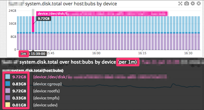
The graph above is a bar graph over the past 2 hours. The graph displays one datapoint per minute. They are not the real values submitted but local aggregates, each one representing one minute of your metric data.
Is it possible to see the real data submitted?
Yes, if you zoom in enough, the graph displays the original values. For example, the Datadog Agent submits data every ~15 seconds. If you look at a 45-minute (or less) time window, the values are unaggregated.

