Create an Integration Dashboard
Overview
Datadog Dashboards enable you to efficiently monitor your infrastructure and integrations by displaying and tracking key metrics. Datadog provides a set of out-of-the-box dashboards for many features and integrations. You can access these by viewing your Dashboard List.
If you have created a Datadog integration, you must create an out-of-the-box dashboard to help your integration’s users more quickly find value in your integration. This guide provides steps for creating an integration dashboard and best practices to follow during the creation process.
To create a Datadog integration, see Create an Agent Integration.
Create an integration dashboard
Create a dashboard
In Datadog, from the Dashboard List, click + New Dashboard.
Follow the best practices in this guide when adding elements to your dashboard.
Export your dashboard
Export your dashboard to JSON by clicking the Share or Configure icon and selecting Export dashboard JSON.
Name the file according to your dashboard title: for example, your_integration_name_overview.json.
Save this file to your integration’s assets/dashboards folder. Add the asset to your manifest.json file. See Integrations Assets Reference for more information about your integration’s file structure and manifest file.
Run the ddev meta dash export command with the --extras or -e flag to export the dashboard definition:
ddev meta dash export <URL_OF_DASHBOARD> <INTEGRATION> --extras
Name the file according to your dashboard title.
This command adds the dashboard definition to your integration’s manifest.json file. You can find the dashboard JSON file in your integration’s assets/dashboards folder.
Note: The dashboard is available at the following address /dash/integration/<DASHBOARD_KEY> in each region. The <DASHBOARD_KEY> matches what is in your dashboard’s manifest.json file. You can swap this value when you want to add a link to another dashboard inside your dashboard.
Open a pull request
For the integrations-extras GitHub repository and open a pull request (PR) to add your dashboard JSON file and updated manifest file to the corresponding integration folder. Datadog reviews all integration-extras PRs. Once approved, Datadog merges the PR and your integration dashboard is pushed to production.
Verify your dashboard in production
Ensure the relevant integration tile is Installed in Datadog. You must install an integration to see its associated out-of-the-box dashboards.
Find your dashboard on the Dashboard List page. Ensure logos render correctly and within the preset dashboard.
Follow dashboard best practices
An integration dashboard should adhere to the following visual style guidelines:
- An attention-grabbing About group with a banner image, concise copy, useful links, and a good typography hierarchy
- A brief, annotated Overview group with the most important statistics at the top
- Simple graph titles and title-case group names
- Symmetry in high density mode
- Well-formatted, concise notes
- Color coordination between related groups, notes within groups, and graphs within groups
General guidelines
When creating a new dashboard, select the default dashboard type.
Put the integration name in your dashboard title. Some examples of a good dashboard title are Scylla or Cilium Overview. Note: Avoid using - (hyphens) in the dashboard title, as the dashboard URL is generated from the title.
Add a logo to the dashboard header. The integration logo automatically appears in the header if the icon exists and the integration_id matches the icon name.
Include an About group for the integration containing a brief description and helpful links. The About section should contain content, not data. Avoid making the About section full-width. Consider copying the content in the About section into the hovercard that appears when hovering over the dashboard title.
Edit the About section and select the banner display option. You can then link to a banner image according to the following file location: /static/images/integration_dashboard/your-image.png.
Include an Overview group containing a few of the most important metrics; service checks, such as liveness or readiness checks; and a monitor summary if you have pre-existing monitors for this integration. Place the overview group at the top of the dashboard. The group can contain data.
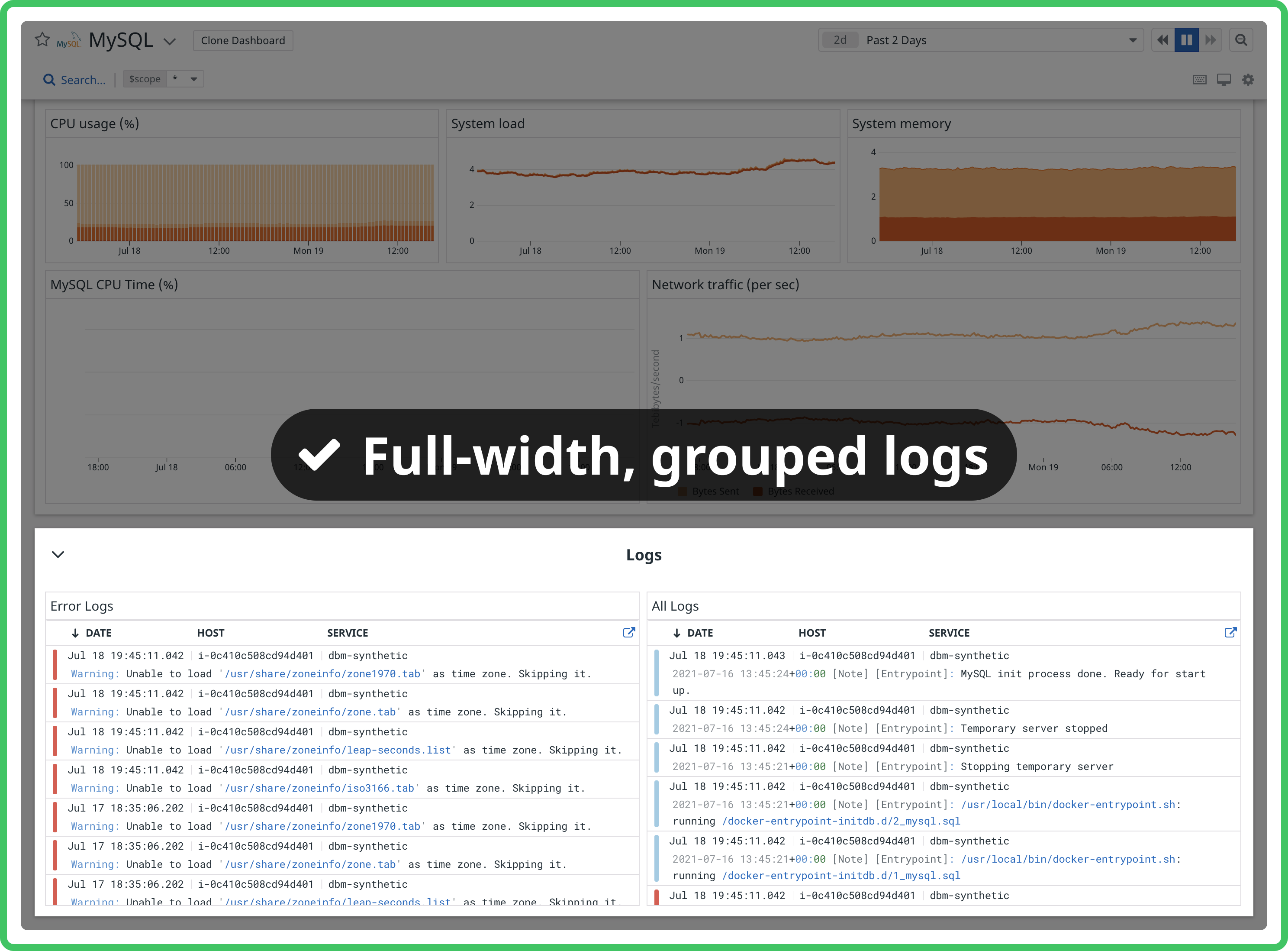
If log collection is enabled for the integration, include a Logs group containing a timeseries widget showing a bar graph of logs by status over time and a log stream of logs with the Error or Critical status. Note: Consider turning groups into powerpacks if they appear repeatedly in dashboards regardless of the integration type so you can insert the entire group with the correct formatting with a few clicks rather than adding the same widgets from scratch each time.
Check to see how your dashboard looks at 1280px wide and 2560px wide. This is how the dashboard appears on a smaller laptop and a larger monitor, respectively. The most common screen widths for dashboards are 1920, 1680, 1440, 2560, and 1280px. If your monitor is not large enough for high density mode, use the browser zoom controls to zoom out.
<div class="shortcode-wrapper shortcode-img expand"><figure class="text-center"><a href="https://datadog-docs.imgix.net/images/developers/create-an-integration-dashboard/qa-widths.d4bd57e9f3d40740ade725aeeb32216e.png?fit=max&auto=format" class="pop" data-bs-toggle="modal" data-bs-target="#popupImageModal"><picture class="" >
<img
class="img-fluid"
srcset="https://datadog-docs.imgix.net/images/developers/create-an-integration-dashboard/qa-widths.d4bd57e9f3d40740ade725aeeb32216e.png?auto=format"
width="80%" alt="An example of a dashboard at 1280 pixels" />
</picture></a></figure>
</div>
<div class="shortcode-wrapper shortcode-img expand"><figure class="text-center"><a href="https://datadog-docs.imgix.net/images/developers/create-an-integration-dashboard/qa-large-widths.77b13793ac5b6450662d315abe9f1f73.png?fit=max&auto=format" class="pop" data-bs-toggle="modal" data-bs-target="#popupImageModal"><picture class="" >
<img
class="img-fluid"
srcset="https://datadog-docs.imgix.net/images/developers/create-an-integration-dashboard/qa-large-widths.77b13793ac5b6450662d315abe9f1f73.png?auto=format"
width="100%" alt="An example of a dashboard at 2560 pixels" />
</picture></a></figure>
</div>
Research the metrics supported by the integration and consider grouping them in relevant categories. Important metrics that are key to the performance and the overview of the integration should be at the top.
- Go from macro to micro levels within the system
- For a database integration’s dashboard, for example, you can group node metrics in one group, index metrics in the next group, and shard metrics in the third group.
- Go from upstream to downstream sections within the system
- For a data streams integration’s dashboard, for example, you can group producer metrics in one group, broker metrics in the next group, and consumer metrics in the third group.
- Group together metrics that lead to the same actionable insights
- You can group indexing metrics that reveal which indexes or shards should be optimized in one group, and group resource utilization metrics like disk space or memory usage that inform allocation and redistribution decisions together in a separate group.
Use Group widgets to title and group sections, rather than note widgets. Use partial width groups to display groups side-by-side. Most dashboards should display every widget within a group.
Timeseries widgets should be at least four columns wide in order not to appear squashed on smaller displays.
Stream widgets should be at least six columns wide, or half the dashboard width, for readability. Place them at the end of a dashboard so they don’t trap scrolling. It’s useful to put stream widgets in a group by themselves so they can be collapsed. Add an event stream only if the service monitored by the dashboard is reporting events. Use sources:service_name.
Try using a mix of widget types and sizes. Explore visualizations and formatting options until you’re confident your dashboard is as clear as it can be. Sometimes a whole dashboard of timeseries is okay, but other times variety can improve legibility. The most commonly used metric widgets are timeseries, query values, and tables. Ensure query value widgets have a timeseries background (for example, “bars”) instead of being blank. For more information on the available widget types, see the list of supported dashboard widgets.
Try to make the left and right halves of your dashboard symmetrical in high density mode. Users with large monitors see your dashboard in high density mode by default, so it’s important that group relationships make sense, and that the dashboard looks good. You can adjust group heights to achieve this, and move groups between the left and right halves.
<div class="shortcode-wrapper shortcode-img expand"><figure class="text-center"><a href="https://datadog-docs.imgix.net/images/developers/create-an-integration-dashboard/symmetrical-dashboard.12e7c32b8053203812ae14e180ea0008.png?fit=max&auto=format" class="pop" data-bs-toggle="modal" data-bs-target="#popupImageModal"><picture class="" >
<img
class="img-fluid"
srcset="https://datadog-docs.imgix.net/images/developers/create-an-integration-dashboard/symmetrical-dashboard.12e7c32b8053203812ae14e180ea0008.png?auto=format"
width="100%" alt="An example of a symmetrical dashboard" />
</picture></a></figure>
</div>
<div class="shortcode-wrapper shortcode-img expand"><figure class="text-center"><a href="https://datadog-docs.imgix.net/images/developers/create-an-integration-dashboard/symmetrical_example_2.bb591c892c8e61103192d124e0930db8.png?fit=max&auto=format" class="pop" data-bs-toggle="modal" data-bs-target="#popupImageModal"><picture class="" >
<img
class="img-fluid"
srcset="https://datadog-docs.imgix.net/images/developers/create-an-integration-dashboard/symmetrical_example_2.bb591c892c8e61103192d124e0930db8.png?auto=format"
width="100%" alt="An example of a symmetrical dashboard" />
</picture></a></figure>
</div>
Template variables allow you to dynamically filter one or more widgets in a dashboard. Template variables must be universal, customized based on the type on integration technology, and accessible by any user or account using the monitored service.
| Type of integration technology | Typical template variable |
|---|
| Database | Shards |
| Data Streaming | Consumer |
| ML Model Serving | Model |
Ensure all relevant graphs are listening to the relevant template variable filters. Note: Adding *=scope as a template variable is useful as users can access all of their own tags.
Copy
Use concise graph titles that start with the most important information. Avoid common phrases such as “number of” and don’t include the integration title (e.g. “Memcached Load”).
| Concise title (good) | Verbose title (bad) |
|---|
| Events per node | Number of Kubernetes events per node |
| Pending tasks: [$node_name] | Total number of pending tasks in [$node_name] |
| Read/write operations | Number of read/write operations |
| Connections to server - rate | Rate of connections to server |
| Load | Memcached Load |
Avoid repeating the group title or integration name in every widget in a group, especially if the widgets are query values with a custom unit of the same name. In this example, note the word “shards” in each widget title in the group named “Shards”.
For the timeseries widget, always alias formulas.
Group titles should be title case. Widget titles should be sentence case.
If you’re showing a legend, make sure the aliases are easy to understand.
Graph titles should summarize the queried metric. Do not indicate the unit in the graph title because unit types are displayed automatically from metadata. An exception to this is if the calculation of the query represents a different type of unit.
Visual style
Format notes to make them fit their use case. Try the presets “caption”, “annotation”, or “header”, or pick your own combination of styles. Avoid using the smallest font size for notes that are long or including complex formatting, like bulleted lists or code blocks.
Use colors to highlight important relationships and to improve readability, not for style. If several groups are related, apply the same group header color to all of them. If you’ve applied a green header color to a group, try making its notes green as well. If two groups are related, but one is more important, try using the “vivid” color on the important group and the “light” color on the less important group. Don’t be afraid to leave groups with white headers, and be careful not to overuse color. For example, don’t make every group on a dashboard vivid blue. Also avoid using gray headers.
Visualizations with obvious thresholds or zones use semantic formatting for graphs or custom red/yellow/green text formatting for query values.
Use legends when they make sense. Legends make it easy to read a graph without having to hover over each series or maximize the widget. Make sure you use timeseries aliases so the legend is easy to read. Automatic mode for legends is a great option that hides legends when space is tight and shows them when there’s room.
If you want users to compare two graphs side-by-side, make sure their x-axes align. If one graph is showing a legend and the other isn’t, the x-axes won’t align. Make sure they both show a legend or both do not.
For timeseries, base the display type on the type of metric.
| Types of metric | Display type |
|---|
| Volume (e.g. Number of connections) | area |
| Counts (e.g. Number of errors) | bars |
| Multiple groups or default | lines |
Further reading
Additional helpful documentation, links, and articles:


