- Agents
- Essentials
- Getting Started
- Agent
- API
- APM Tracing
- Containers
- Dashboards
- Database Monitoring
- Datadog
- Datadog Site
- DevSecOps
- Incident Management
- Integrations
- Internal Developer Portal
- Logs
- Monitors
- Notebooks
- OpenTelemetry
- Profiler
- Search
- Session Replay
- Security
- Serverless for AWS Lambda
- Software Delivery
- Synthetic Monitoring and Testing
- Tags
- Workflow Automation
- Learning Center
- Support
- Glossary
- Standard Attributes
- Guides
- Agent
- Integrations
- Extend Datadog
- Authorization
- DogStatsD
- Custom Checks
- Integrations
- Build an Integration with Datadog
- Create an Agent-based Integration
- Create an API-based Integration
- Create a Log Pipeline
- Integration Assets Reference
- Build a Marketplace Offering
- Create an Integration Dashboard
- Create a Monitor Template
- Create a Cloud SIEM Detection Rule
- Install Agent Integration Developer Tool
- Service Checks
- Community
- Guides
- OpenTelemetry
- Administrator's Guide
- API
- Partners
- Datadog Mobile App
- DDSQL Reference
- CoScreen
- CoTerm
- Remote Configuration
- Cloudcraft (Standalone)
- In The App
- Dashboards
- Notebooks
- DDSQL Editor
- Reference Tables
- Sheets
- Monitors and Alerting
- Service Level Objectives
- Metrics
- Watchdog
- Bits AI
- Internal Developer Portal
- Error Tracking
- Change Tracking
- Event Management
- Incident Response
- Actions & Remediations
- Infrastructure
- Cloudcraft
- Resource Catalog
- Universal Service Monitoring
- End User Device Monitoring
- Hosts
- Containers
- Processes
- Serverless
- Network Monitoring
- Storage Management
- Cloud Cost
- Application Performance
- APM
- Continuous Profiler
- Database Monitoring
- Agent Integration Overhead
- Setup Architectures
- Setting Up Postgres
- Setting Up MySQL
- Setting Up SQL Server
- Setting Up Oracle
- Setting Up Amazon DocumentDB
- Setting Up MongoDB
- Setting Up ClickHouse
- Connecting DBM and Traces
- Data Collected
- Exploring Database Hosts
- Exploring Query Metrics
- Exploring Query Samples
- Exploring Database Schemas
- Exploring Recommendations
- Troubleshooting
- Guides
- Data Streams Monitoring
- Data Observability
- Digital Experience
- Real User Monitoring
- Synthetic Testing and Monitoring
- Continuous Testing
- Experiments
- Product Analytics
- Session Replay
- Software Delivery
- CI Visibility
- CD Visibility
- Deployment Gates
- Test Optimization
- Code Coverage
- PR Gates
- DORA Metrics
- Feature Flags
- Developer Integrations
- Security
- Security Overview
- Cloud SIEM
- Code Security
- Cloud Security
- App and API Protection
- AI Guard
- Workload Protection
- Sensitive Data Scanner
- AI Observability
- Log Management
- Observability Pipelines
- Configuration
- Sources
- Processors
- Destinations
- Packs
- Akamai CDN
- Amazon CloudFront
- Amazon VPC Flow Logs
- AWS Application Load Balancer Logs
- AWS CloudTrail
- AWS Elastic Load Balancer Logs
- AWS Network Load Balancer Logs
- Cisco ASA
- Cloudflare
- F5
- Fastly
- Fortinet Firewall
- HAProxy Ingress
- Istio Proxy
- Juniper SRX Firewall Traffic Logs
- Netskope
- NGINX
- Okta
- Palo Alto Firewall
- Windows XML
- ZScaler ZIA DNS
- Zscaler ZIA Firewall
- Zscaler ZIA Tunnel
- Zscaler ZIA Web Logs
- Search Syntax
- Scaling and Performance
- Monitoring and Troubleshooting
- Guides and Resources
- Log Management
- CloudPrem
- Administration
- Account Management
- Data Security
- Help
Query to the Graph
This page focuses on describing the steps performed by Datadog’s graphing system from the query to the graph, so that you get a good idea how to choose your graph settings.
When creating a graph in a timeboard or screenboard, you can use the editor or the JSON tab to set up advanced queries. The example below uses the metric system.disk.total coming from a specific server (host:bubs).
Next, follow each step executed by the Datadog backend to perform the query and render a graph line on your dashboard.
At each step, this article notes the effect of each parameter of the query. Before the query, storage: data is stored separately depending on the tags
The metric system.disk.total (collected by default by the datadog-agent) is seen from different sources.
This is because this metric is reported by different hosts, and also because each datadog-agent collects this metric per device. It adds to the metric system.disk.total the tag device:tmpfs when sending data associated to the disk with the same name, etc.
Thus, this metric is seen with different {host, device} tag combinations.
For each source (defined by a host and a set of tags), data is stored separately.
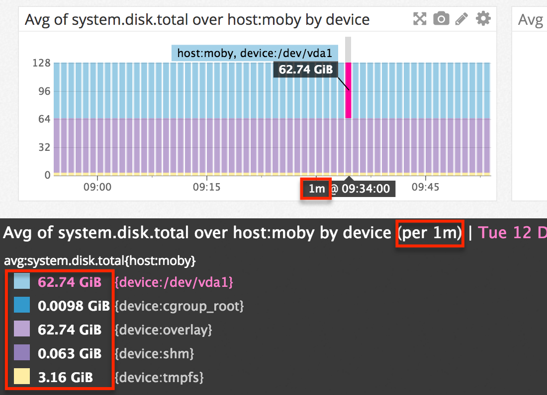
In this example, consider host:bubs as having 5 devices. Thus, Datadog is storing 5 timeseries (all datapoints submitted over time for a source) for:
{host:bubs, device:tmpfs}{host:bubs, device:cgroup_root}{host:bubs, device:/dev/vda1}{host:bubs, device:overlay}{host:bubs, device:shm}
Next, consider the successive steps followed by the backend for the query presented above.
Find which timeseries are needed for the query
In this query, you only asked for data associated to host:bubs. So the first step for Datadog’s backend is to scan all sources (in this case all {host, device} combinations with which metric system.disk.total is submitted) and only retain those corresponding to the scope of the query.
As you may have guessed, the backend finds five matching sources (see previous paragraph).
The idea is then to aggregate data from these sources together to give you a metric representing the system.disk.total for your host. This is done at step 3.
Note: The tagging system adopted by Datadog is simple and powerful. You don’t have to know or specify the sources to combine—you just have to give a tag, such as an ID, and Datadog combines all data with this ID and not the rest. For instance, you don’t need to know the number of hosts or devices you have when you query system.disk.total{*}. Datadog aggregates data from all sources for you.
More information about timeseries and tag cardinality
Parameter involved: scope
You can use more than one tag, such as {host:bubs, device:udev}, if you want to fetch data corresponding to both tags.
Proceed to time-aggregation
Datadog’s backend selects all data corresponding to the time period of your graph.
However, before combining all data from the different sources (step 3), Datadog needs to proceed to time aggregation.
Why?
As Datadog stores data at a 1 second granularity, it cannot display all real data on graphs. See metric aggregation for more details.
For a graph on a 1-week time window, it would require sending hundreds of thousands of values to your browser—and besides, not all these points could be graphed on a widget occupying a small portion of your screen. For these reasons, Datadog is forced to proceed to data aggregation and to send a limited number of points to your browser to render a graph.
Which granularity?
For instance, on a one-day view with the ’lines’ display, there is one datapoint every 5 minutes. The Datadog backend slices the 1-day interval into 288 buckets of 5 minutes. For each bucket, the backend rolls up all data into a single value. For instance, the datapoint rendered on your graph with timestamp 07:00 is actually an aggregate of all real datapoints submitted between 07:00:00 and 07:05:00 that day.
How?
By default, the Datadog backend computes the rollup aggregate by averaging all real values, which tends to smooth out graphs as you zoom out. See more information about why zooming out a timeframe also smooths out your graphs. Data aggregation needs to occur whether you have 1 or 1000 sources as long as you look at a large time window. What you generally see on graph is not the real values submitted but local aggregates.
Datadog’s backend computes a series of local aggregates for each source corresponding to the query.
However, you can control how this aggregation is performed.
Parameter involved: rollup (optional) How to use the ‘rollup’ function?
In this example, rollup(avg,60) defines an aggregate period of 60 seconds. So the X minutes interval is sliced into Y intervals of 1 minute each. Data within a given minute is aggregated into a single point that shows up on your graph (after step 3, the space aggregation).
Note: The Datadog backend tries to keep the number of intervals to a number below ~300. So if you do rollup(60) over a 2-month time window, you do not get the one-minute granularity requested.
Proceed to space-aggregation
Next, you can mix data from different sources into a single line.
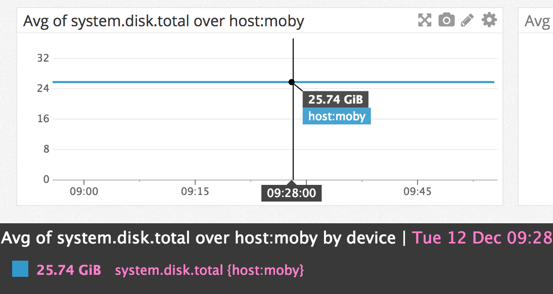
You have ~300 points for each source. Each of them represents a minute. In this example, for each minute, Datadog computes the average across all sources, resulting in the following graph:
The value obtained (25.74GB) is the average of the values reported by all sources (see previous image).
Note: If there is only one source (for instance, if you chose the scope {host:bubs, device:/dev/disk} for the query), using sum/avg/max/min has no effect as no space aggregation needs to be performed. See the FAQ on switching between the sum/min/max/avg aggregators.
Parameter involved: space aggregator
Datadog offers 4 space aggregators:
maxminavgsum
Apply functions (optional)
Functions can be applied to arithmetic in the Formula box when graphing data. Most of the functions are applied at the last step. From the ~300 points obtained after time (step 2) and space (step 3) aggregations, the function computes new values which can be seen on your graph.
In this example the function abs makes sure that your results are positive numbers.
Parameter involved: function
Choose your type of functions
- Algorithmic: Implement Anomaly or Outlier detection on your metric.
Grouped queries, arithmetic, as_count/rate
Grouped queries
The logic is the same:
- The Datadog backend finds all different devices associated to the source selected.
- For each device, the backend performs the query
system.disk.total{host:example, device:<DEVICE>}as explained in this article. - All final results are graphed on the same graph.
Note: rollup or as_count modifiers have to be placed after the by {device} mention.
Note2: You can use multiple tags, for instance: system.disk.in_use{*} by {host,device}.
Arithmetic
Arithmetic is applied after time and space aggregation as well—(step 4: Apply function).
Count and rate
as_count and as_rate are time aggregators specific to rates and counters submitted with StatsD or DogStatsD. They make it possible to view metrics as a rate per second, or to see them as raw counts.
Syntax: instead of adding a rollup, you can use .as_count() or .as_rate().
For more information, see Visualize StatsD metrics with Counts Graphing. Documentation about StatsD/DogStatsD.


