- Essentials
- Getting Started
- Agent
- API
- APM Tracing
- Containers
- Dashboards
- Database Monitoring
- Datadog
- Datadog Site
- DevSecOps
- Incident Management
- Integrations
- Internal Developer Portal
- Logs
- Monitors
- Notebooks
- OpenTelemetry
- Profiler
- Search
- Session Replay
- Security
- Serverless for AWS Lambda
- Software Delivery
- Synthetic Monitoring and Testing
- Tags
- Workflow Automation
- Learning Center
- Support
- Glossary
- Standard Attributes
- Guides
- Agent
- Integrations
- Extend Datadog
- Authorization
- DogStatsD
- Custom Checks
- Integrations
- Build an Integration with Datadog
- Create an Agent-based Integration
- Create an API-based Integration
- Create a Log Pipeline
- Integration Assets Reference
- Build a Marketplace Offering
- Create an Integration Dashboard
- Create a Monitor Template
- Create a Cloud SIEM Detection Rule
- Install Agent Integration Developer Tool
- Service Checks
- Community
- Guides
- OpenTelemetry
- Administrator's Guide
- API
- Partners
- Datadog Mobile App
- DDSQL Reference
- CoScreen
- CoTerm
- Remote Configuration
- Cloudcraft (Standalone)
- In The App
- Dashboards
- Notebooks
- DDSQL Editor
- Reference Tables
- Sheets
- Monitors and Alerting
- Service Level Objectives
- Metrics
- Watchdog
- Bits AI
- Internal Developer Portal
- Error Tracking
- Change Tracking
- Event Management
- Incident Response
- Actions & Remediations
- Infrastructure
- Cloudcraft
- Resource Catalog
- Universal Service Monitoring
- End User Device Monitoring
- Hosts
- Containers
- Processes
- Serverless
- Network Monitoring
- Storage Management
- Cloud Cost
- Application Performance
- APM
- Continuous Profiler
- Database Monitoring
- Agent Integration Overhead
- Setup Architectures
- Setting Up Postgres
- Setting Up MySQL
- Setting Up SQL Server
- Setting Up Oracle
- Setting Up Amazon DocumentDB
- Setting Up MongoDB
- Connecting DBM and Traces
- Data Collected
- Exploring Database Hosts
- Exploring Query Metrics
- Exploring Query Samples
- Exploring Database Schemas
- Exploring Recommendations
- Troubleshooting
- Guides
- Data Streams Monitoring
- Data Observability
- Digital Experience
- Real User Monitoring
- Synthetic Testing and Monitoring
- Continuous Testing
- Product Analytics
- Session Replay
- Software Delivery
- CI Visibility
- CD Visibility
- Deployment Gates
- Test Optimization
- Code Coverage
- PR Gates
- DORA Metrics
- Feature Flags
- Developer Integrations
- Security
- Security Overview
- Cloud SIEM
- Code Security
- Cloud Security
- App and API Protection
- AI Guard
- Workload Protection
- Sensitive Data Scanner
- AI Observability
- Log Management
- Observability Pipelines
- Configuration
- Sources
- Processors
- Destinations
- Packs
- Akamai CDN
- Amazon CloudFront
- Amazon VPC Flow Logs
- AWS Application Load Balancer Logs
- AWS CloudTrail
- AWS Elastic Load Balancer Logs
- AWS Network Load Balancer Logs
- Cisco ASA
- Cloudflare
- F5
- Fastly
- Fortinet Firewall
- HAProxy Ingress
- Istio Proxy
- Juniper SRX Firewall Traffic Logs
- Netskope
- NGINX
- Okta
- Palo Alto Firewall
- Windows XML
- ZScaler ZIA DNS
- Zscaler ZIA Firewall
- Zscaler ZIA Tunnel
- Zscaler ZIA Web Logs
- Search Syntax
- Scaling and Performance
- Monitoring and Troubleshooting
- Guides and Resources
- Log Management
- CloudPrem
- Administration
JavaScript Expressions
This product is not supported for your selected Datadog site. ().
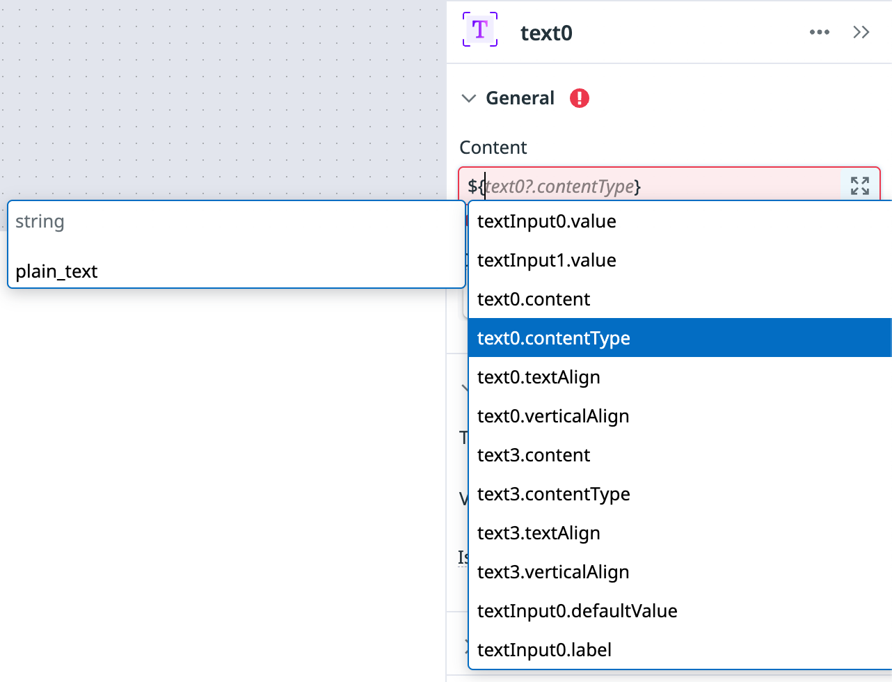
You can use JavaScript (JS) expressions anywhere in App Builder to create custom interactions between the different parts of your app. As you begin an expression, App Builder offers autocomplete suggestions based on the existing queries and components in your app. Click on an autocomplete suggestion to use it in your expression, or use the arrow keys on your keyboard and make a selection with the Enter key.
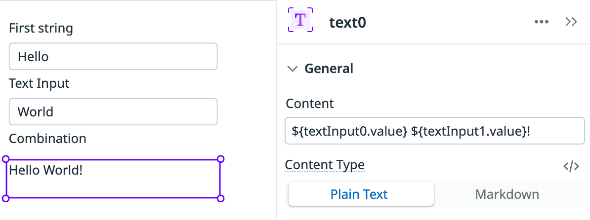
Some fields, like post-query transformation, display a code editor by default and accept plain JS. In all other fields, enclose your JS expressions in ${}. For example, to interpolate the values of two text input components named textInput0 and textInput1 into the Content property of a text component (and add an exclamation mark), use the expression ${textInput0.value} ${textInput1.value}!.
App Builder accepts standard vanilla JavaScript syntax, with the following caveats:
- The result of the expression must match the result expected by the component or query property. For example, the text component’s Is Visible property expects a Boolean. To find out what type of data a component property expects, see View component properties.
- Your code has read-only access to the app state, but App Builder executes the code in a sandboxed environment with no access to the Document Object Model (DOM) or browser APIs.
You can also use Bits AI to work with JS expressions:
- Click the Build with AI icon ().
- Enter a custom prompt, or try the prompt
How can you help me with JavaScript expressions?.
View component properties
Before you create an expression, it’s helpful to know the available properties and defaults or current values for the component you want to interact with.
You can view the available properties and values for a component in the following ways:
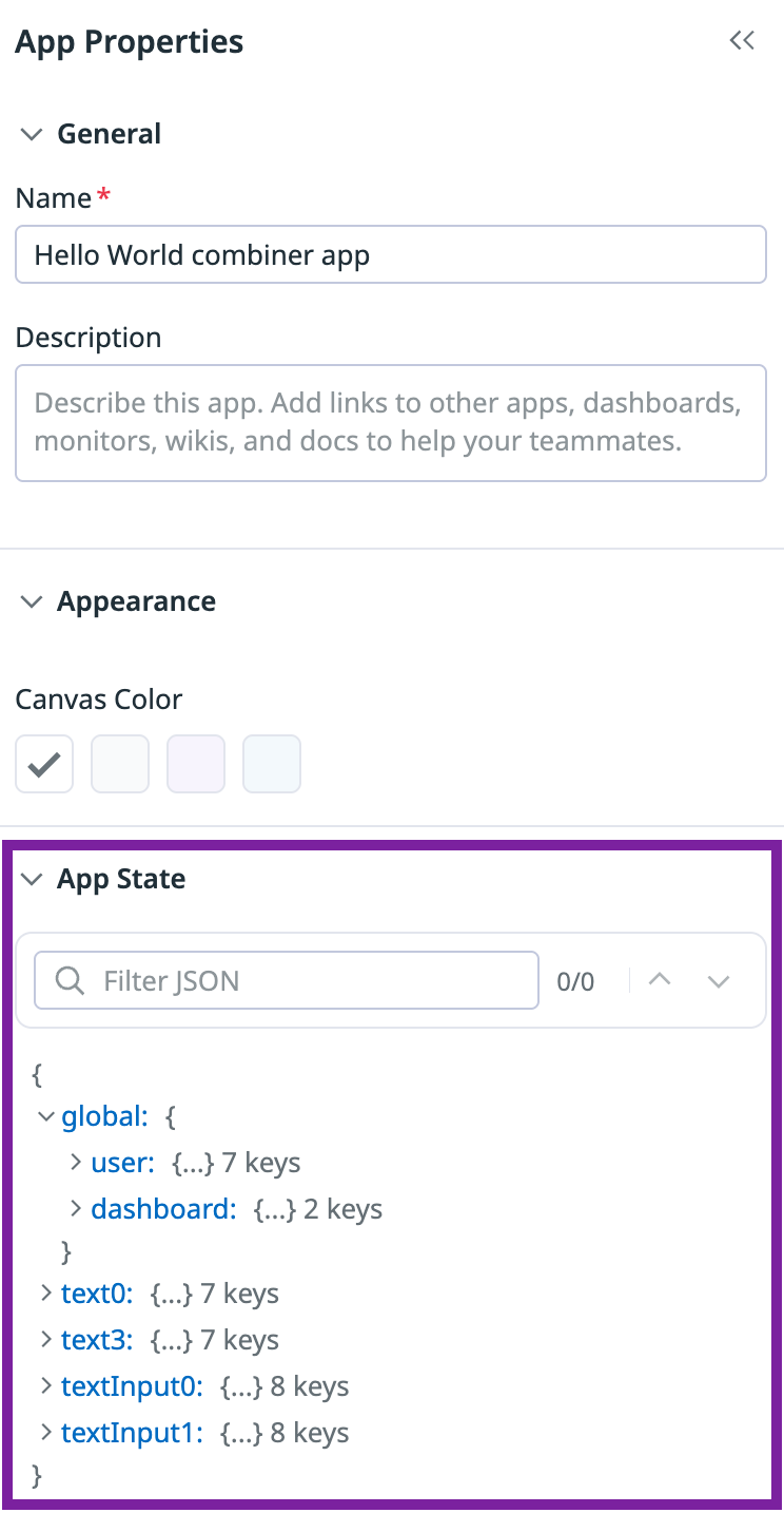
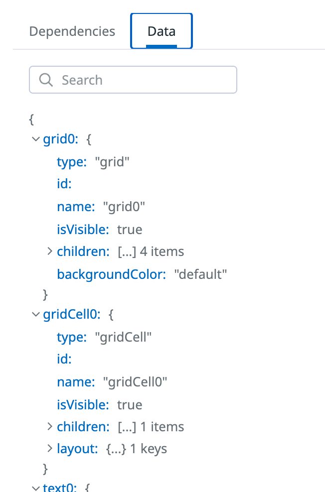
- App State: Provides properties and values for all components and queries in your app, as well as global variables such as state variables or dashboard template variables.
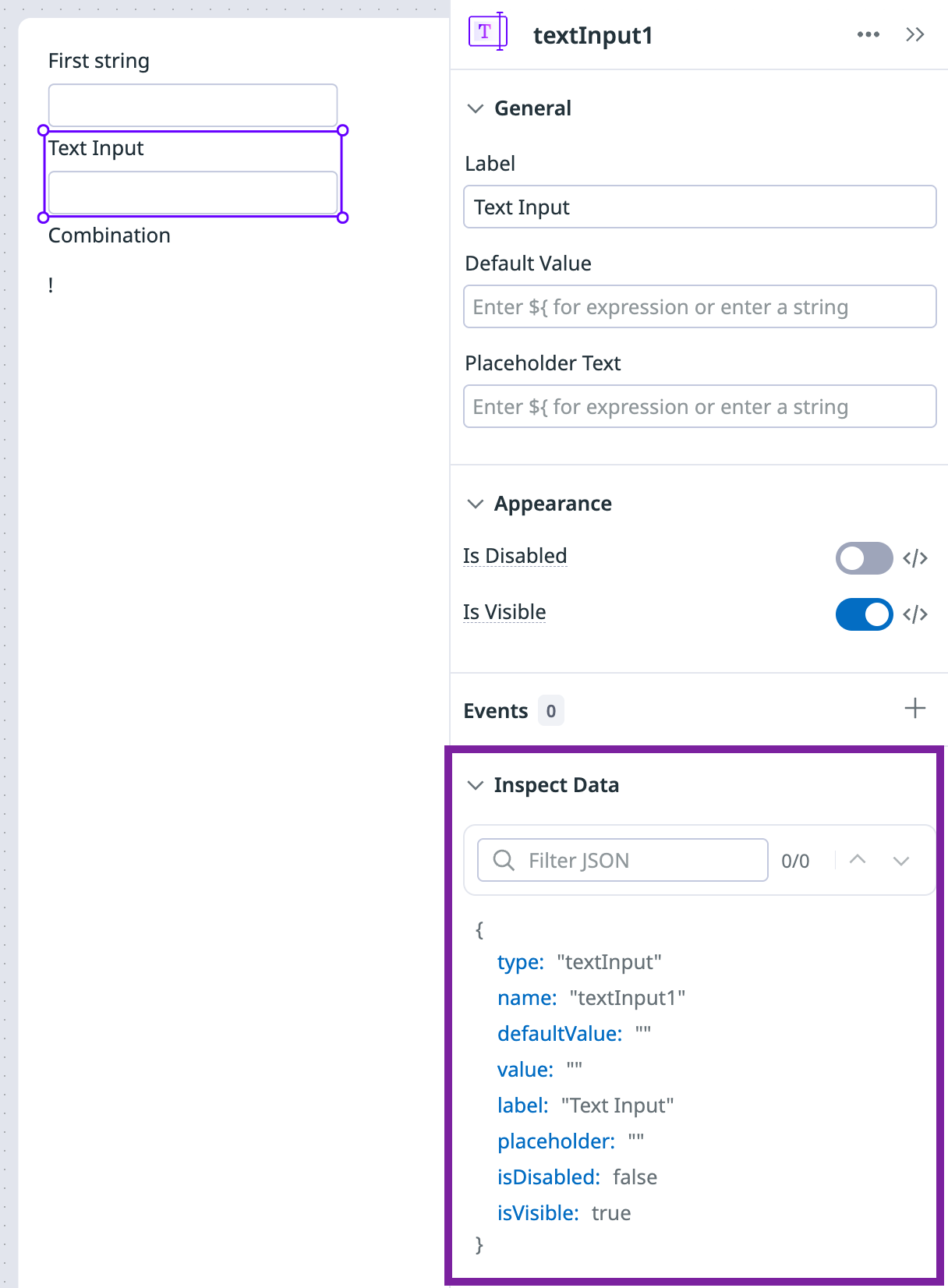
- Inspect Data: Provides properties and values for a specific component or query in your app.
- The Admin Console: The Data tab of the Admin Console provides properties and values for all components and queries in your app.
App State
App State
To access App State:
- Click App Properties in the left side-panel.
- Scroll down to the App State section.
Inspect Data
Inspect Data
To access Inspect Data:
- Click on the query or component you want to inspect.
- Scroll down to the Inspect Data section.
Admin Console
Admin Console
To access the Admin Console:
- Click on the cog (Settings) icon and select Admin Console.
- Click Data.
Custom component interactions
Most UI components provide built-in options, such as toggles and text alignment, that cover basic app usage. To add a custom interaction to a component, click the code editor symbol (</>) and enter a JS expression.
Conditional visibility
You can make the visibility of a component dependent on other components.
For example, if you want a text component to be visible only when two text input components named textInput0 and textInput1 have values, use the expression ${textInput0.value && textInput1.value} in the Is Visible property.
Disable a component conditionally
Similar to visibility, you can disable a component unless conditions are met by other aspects of your app, such as other components or the app context.
Disable a component based on visibility
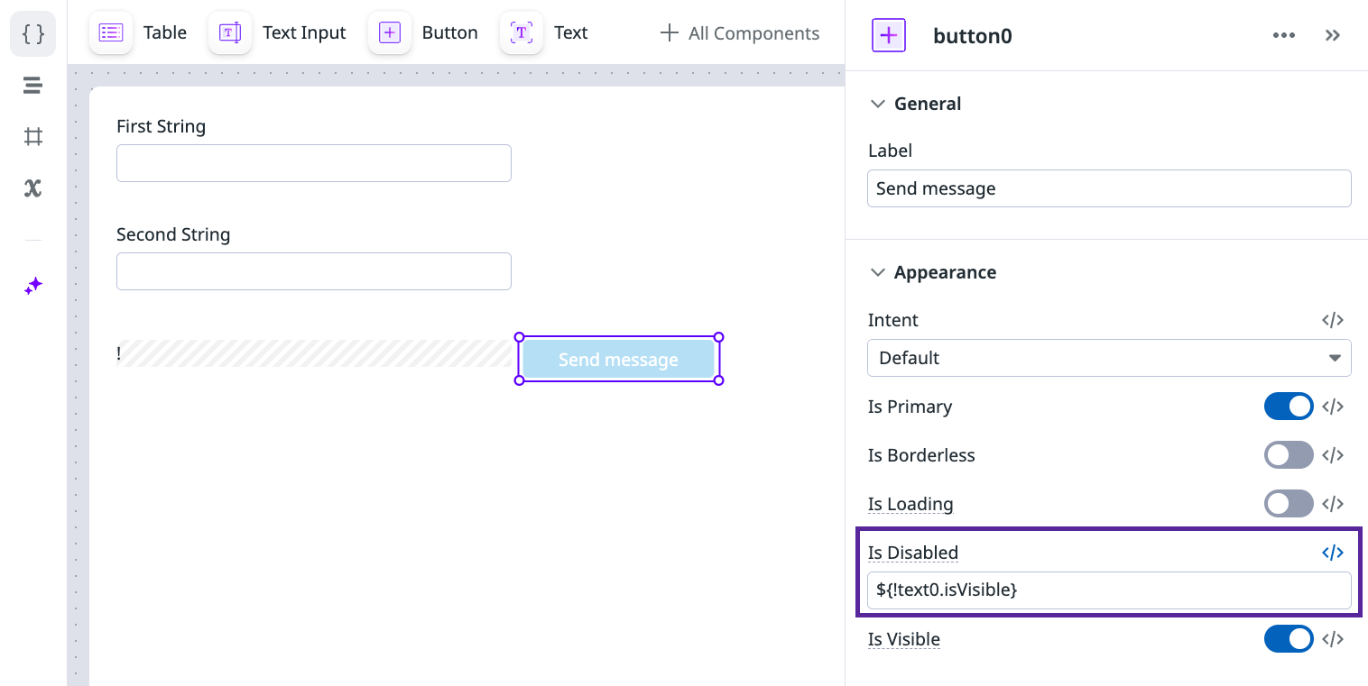
If your app has a button that uses the content from a text component to send a message, you can disable the button unless the text component is visible:
- Click the button component on your canvas.
- Click the code editor symbol (</>) next to the Is Disabled property.
- Add the expression
${!text0.isVisible}.
The text component is invisible and the button is disabled unless both text input fields have content.
Disable a component based on the app context
You can also disable a component based on the app context, such as the team that the user is on.
For example, you can enable a component only for users who are in the Product Management team:
- Click the button component on your canvas.
- Click the code editor symbol (</>) next to the Is Disabled property.
- Add the expression
${global.user.teams[0].name == 'Product Management'}.
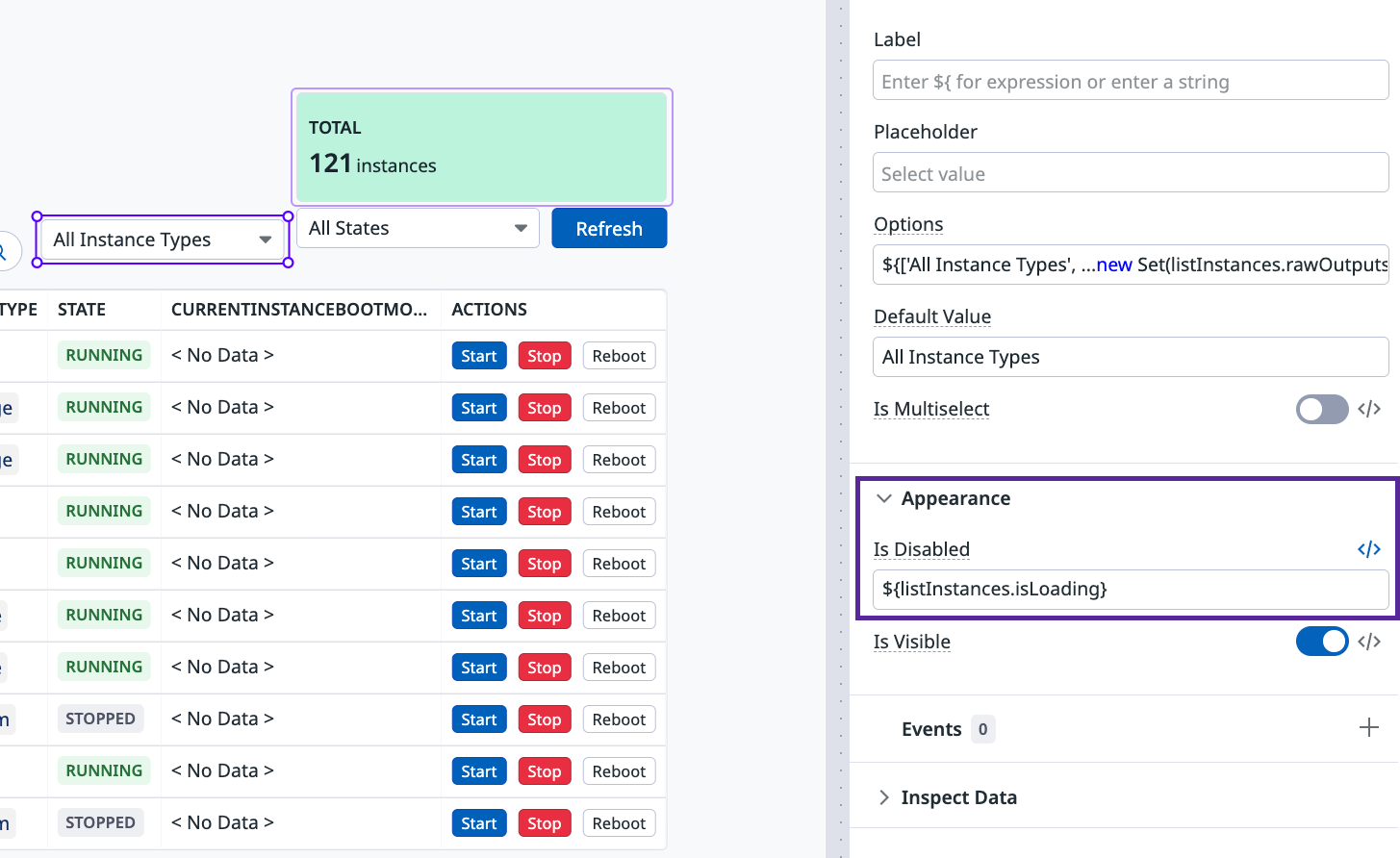
Disable a component while loading
Another common use case is disabling a component while a query is in a loading state. In the EC2 Management blueprint, the instanceType select component is disabled while the listInstances query is loading. To accomplish this, the Is Disabled property uses the expression ${listInstances.isLoading}.
Custom query interactions
Similar to components, you can use JS expressions to alter your queries based on user interaction.
Filter query results on user input
The PagerDuty On-call Schedules blueprint filters the result of the listSchedules query based on input from the user. The user selects a team and user from the team and user select components.
Inside the listSchedules query, the following post-query transformation filters the results based on the values of team and user:
return outputs.body.schedules.map( s => {
    return {
        ...s,
        users: s.users.map(u => u.summary),
        teams: s.teams.map(u => u.summary)
    }
}).filter(s => {

        const matchesName = !name.value.length ? true : s.name.toLowerCase().includes(name.value.toLowerCase());
        const matchesTeam = team.value === 'Any Team' ? true : s.teams.includes(team.value);
        const matchesUser = user.value === 'Any User' ? true : s.users.includes(user.value);

        return matchesName && matchesUser && matchesTeam ;
    }) || []
Setting the query’s Run Settings to Auto allows the query to run each time a user changes a value in the team or user components.
Further reading
Additional helpful documentation, links, and articles:
