- Essentials
- Getting Started
- Agent
- API
- APM Tracing
- Containers
- Dashboards
- Database Monitoring
- Datadog
- Datadog Site
- DevSecOps
- Incident Management
- Integrations
- Internal Developer Portal
- Logs
- Monitors
- Notebooks
- OpenTelemetry
- Profiler
- Search
- Session Replay
- Security
- Serverless for AWS Lambda
- Software Delivery
- Synthetic Monitoring and Testing
- Tags
- Workflow Automation
- Learning Center
- Support
- Glossary
- Standard Attributes
- Guides
- Agent
- Integrations
- Developers
- Authorization
- DogStatsD
- Custom Checks
- Integrations
- Build an Integration with Datadog
- Create an Agent-based Integration
- Create an API-based Integration
- Create a Log Pipeline
- Integration Assets Reference
- Build a Marketplace Offering
- Create an Integration Dashboard
- Create a Monitor Template
- Create a Cloud SIEM Detection Rule
- Install Agent Integration Developer Tool
- Service Checks
- IDE Plugins
- Community
- Guides
- OpenTelemetry
- Administrator's Guide
- API
- Partners
- Datadog Mobile App
- DDSQL Reference
- CoScreen
- CoTerm
- Remote Configuration
- Cloudcraft (Standalone)
- In The App
- Dashboards
- Notebooks
- DDSQL Editor
- Reference Tables
- Sheets
- Monitors and Alerting
- Service Level Objectives
- Metrics
- Watchdog
- Bits AI
- Internal Developer Portal
- Error Tracking
- Change Tracking
- Event Management
- Incident Response
- Actions & Remediations
- Infrastructure
- Cloudcraft
- Resource Catalog
- Universal Service Monitoring
- End User Device Monitoring
- Hosts
- Containers
- Processes
- Serverless
- Network Monitoring
- Storage Management
- Cloud Cost
- Application Performance
- APM
- Continuous Profiler
- Database Monitoring
- Agent Integration Overhead
- Setup Architectures
- Setting Up Postgres
- Setting Up MySQL
- Setting Up SQL Server
- Setting Up Oracle
- Setting Up Amazon DocumentDB
- Setting Up MongoDB
- Connecting DBM and Traces
- Data Collected
- Exploring Database Hosts
- Exploring Query Metrics
- Exploring Query Samples
- Exploring Database Schemas
- Exploring Recommendations
- Troubleshooting
- Guides
- Data Streams Monitoring
- Data Observability
- Digital Experience
- Real User Monitoring
- Synthetic Testing and Monitoring
- Continuous Testing
- Product Analytics
- Session Replay
- Software Delivery
- CI Visibility
- CD Visibility
- Deployment Gates
- Test Optimization
- Code Coverage
- PR Gates
- DORA Metrics
- Feature Flags
- Security
- Security Overview
- Cloud SIEM
- Code Security
- Cloud Security
- App and API Protection
- AI Guard
- Workload Protection
- Sensitive Data Scanner
- AI Observability
- Log Management
- Observability Pipelines
- Configuration
- Sources
- Processors
- Destinations
- Packs
- Akamai CDN
- Amazon CloudFront
- Amazon VPC Flow Logs
- AWS Application Load Balancer Logs
- AWS CloudTrail
- AWS Elastic Load Balancer Logs
- AWS Network Load Balancer Logs
- Cisco ASA
- Cloudflare
- F5
- Fastly
- Fortinet Firewall
- HAProxy Ingress
- Istio Proxy
- Juniper SRX Firewall Traffic Logs
- Netskope
- NGINX
- Okta
- Palo Alto Firewall
- Windows XML
- ZScaler ZIA DNS
- Zscaler ZIA Firewall
- Zscaler ZIA Tunnel
- Zscaler ZIA Web Logs
- Search Syntax
- Scaling and Performance
- Monitoring and Troubleshooting
- Guides and Resources
- Log Management
- CloudPrem
- Administration
Retention Analysis
Overview
Retention Analysis measures how often users are successfully returning to a page or action helping you assess the ongoing value of your products and features.
User retention is measured within a given cohort of users that you define. A cohort is a group of users who performed the start event, such as clicking a link. A user in the cohort is considered retained if they subsequently complete the configured return event, such as clicking the same link again or clicking a Proceed to Payment button.
Only views and actions can act as events.
Prerequisites
For user retention data to populate, you must set the usr.id attribute in your SDK. See the instructions for sending unique user attributes.
Measuring retention events
Product analytics support two types of retention event measurements:
Return on
For each cohort and return period, Return on calculates the percentage of users who triggered the return event during that specific period.
Return on highlights the likelihood of users completing the return event, some period of time (for example, days or weeks), after the start event. This is especially helpful when assessing overall retention across your features and products.
Return on or after
For each cohort and return period, Return on or after calculates the percentage of users who triggered the return event during that specific period or any subsequent period.
Return on or after highlights users who either fully leave your product or stop using key functionalities, which is helpful when assessing the effectiveness of onboarding experiences.
Calculating retention events
What is a weighted average cohort
The weighted average cohort summarizes overall cohort behavior by accounting for cohort size. Larger cohorts have more influence on the final value, making the result more representative than an average.
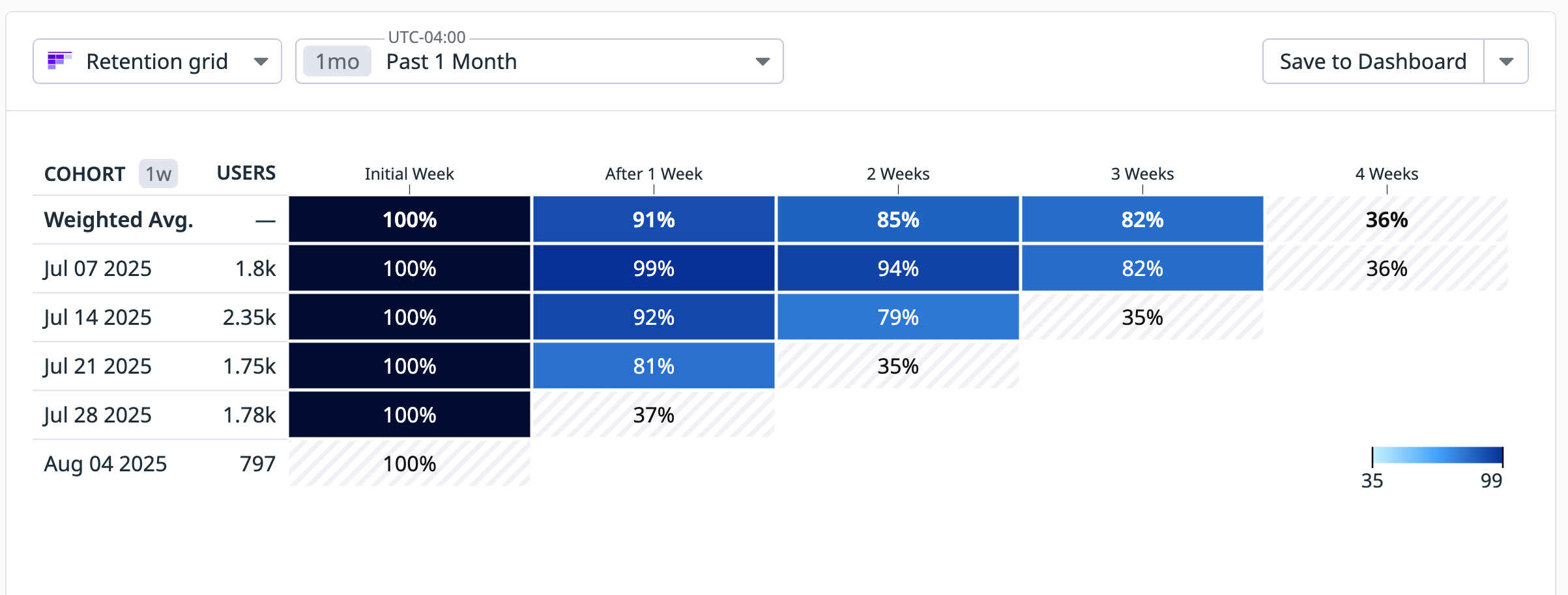
This weighted average calculation is applied across all visualization types. For example, in the retention grid, the weighted average is used to populate the summary cell for each time interval.
How to calculate a weighted average cohort
To compute the value for a specific interval (such as Week 1 in the retention grid), multiply each cohort’s value by its size, sum the results, and divide by the total cohort size. The formula is:
Weighted Average = (Σ (cohort_value × cohort_size)) / (Σ cohort_size)
The weighted average retention of 91% after 1 week shown in the following retention graph is calculated as follows:
(99 * 1.8k + 92 * 2.35k + 81 * 1.75k) / (1.8k + 2.35k + 1.75k)
This means each cohort’s retention rate is scaled by its number of users before contributing to the overall metric.
Note: The retention chart displays greyed-out values when data is partial or incomplete. This occurs when the time period is ongoing and retention cannot yet be fully calculated.
Grouping retention events
Use the group by function to break down retention based on events’ attributes. This is helpful is you want to, for example, see how retention compares across user countries. The group by function is applied to the start event.
Build a graph
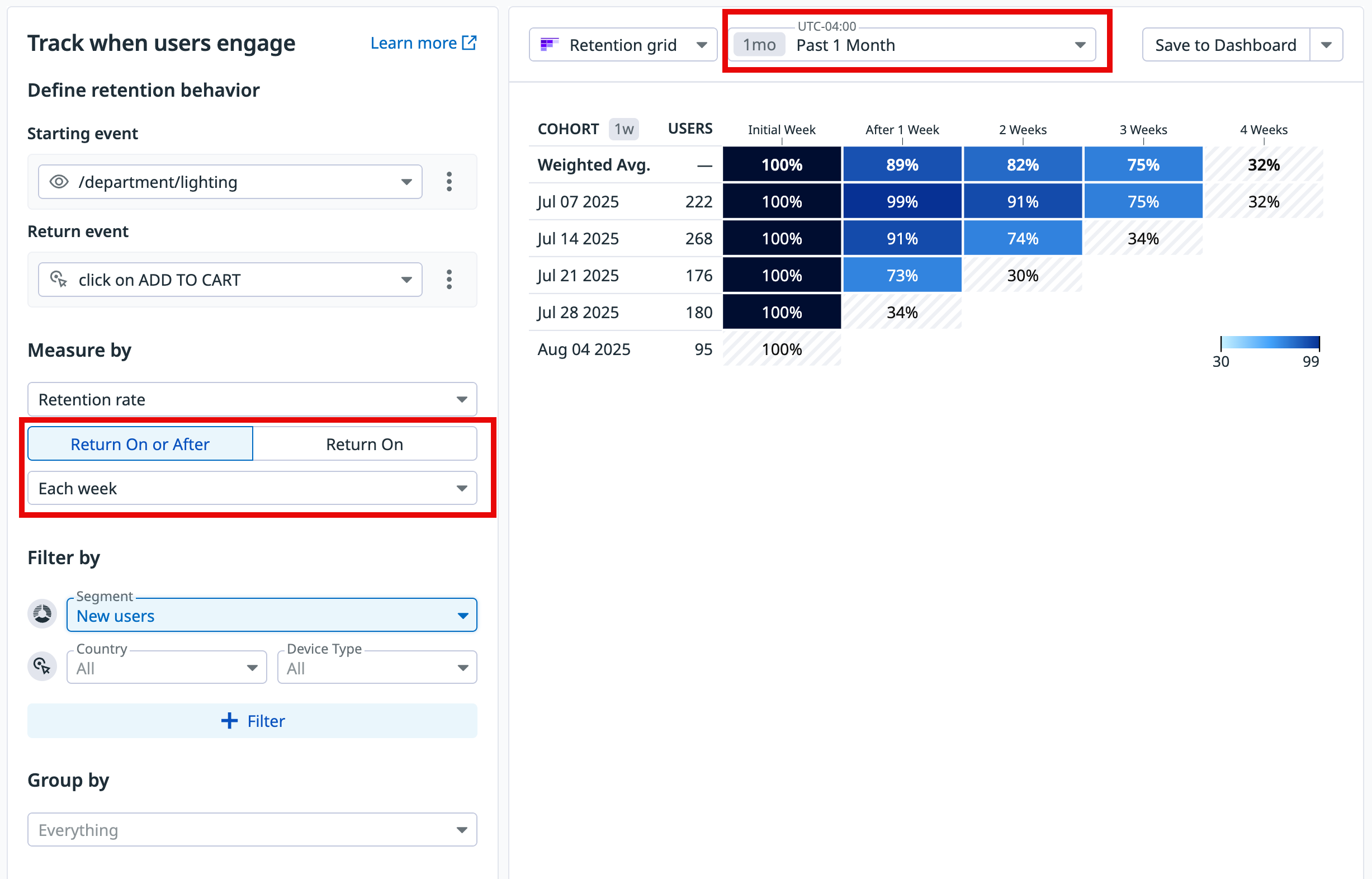
To build a retention graph, navigate to Product Analytics > Charts, click the Retention tab, then follow the steps below.
1. Define the starting and return events
- Select the view or action to act as the starting event for defining a group of users.
- Select the view or action to act as the return event.
2. Define the measures
- Select
Retention rateto see the data in percentages, orUnique usersto see the absolute number of users. - Scope the retention measure
Return on or afterorReturn onbased on when the return event occurs. - Choose the time frame for which you want to analyze user retention. Select a period size (day, week, or month) to define how return events are grouped in the analysis. Consider the following when selecting a period size:
- Daily retention: Can be applied for up to a month.
- Weekly retention: Can be applied for up to a year.
- Monthly retention: Can be applied for up to 16 months.
3. Define users and add filters
Optionally, select a specific segment to measure the retention of its users. This defaults to all users. You can also add any desired filter criteria, such as user country, device type, or operating system.
4. Group by
Optionally, group by event attributes to compare retention by device type, for example.
Analyze the graph
For insights on user retention week over week, read each row of the graph horizontally from left to right.
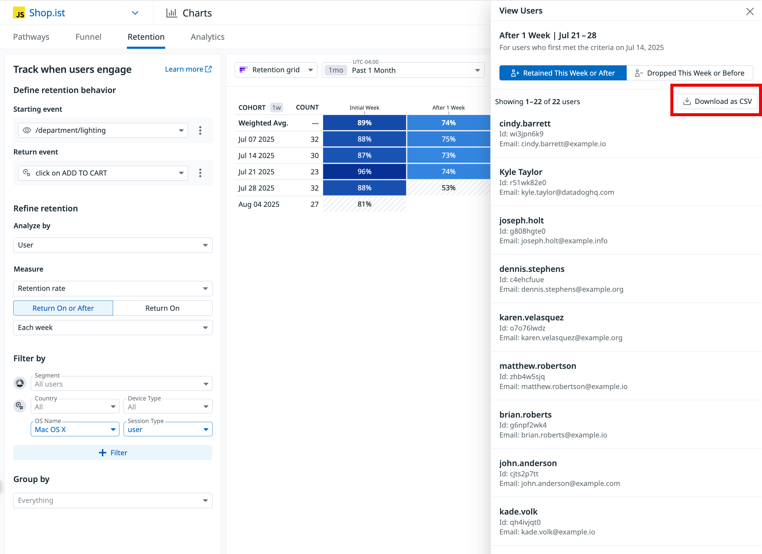
You can click on an individual diagram cell to view a list of users, and export the list as a CSV:
The graph displays slightly different information depending on whether the initial and return events match.
Matching events
If the starting and returning events match:
- Week 0 is always 100%, since it represents all of the users who completed the initial event.
- The other cells compare the viewers in a given week to Week 0, displaying the percentage of the cohort who completed the event in that week.
Reading the Dec 04 2023 row of the above graph from left to right:
- 94% of the people who completed the event in Week 0 came back and completed it again in Week 1.
- 92% of the people who completed the event in Week 0 came back and completed it again in Week 2.
Differing events
If the starting and returning events differ:
- Week 0 represents users who completed both the initial and return events.
- After Week 0, each cell displays the percentage of the Users column who completed the return event in that week.
Reading the Dec 04 2023 row of the above graph from left to right:
- 144 users completed the initial event.
- In Week 0, 94% of those 144 users completed the return event.
- In Week 1, 92% of the 144 users completed the return event.
Visualization types
After building your graph, select the relevant visualization type to surface the information you need under the search query.
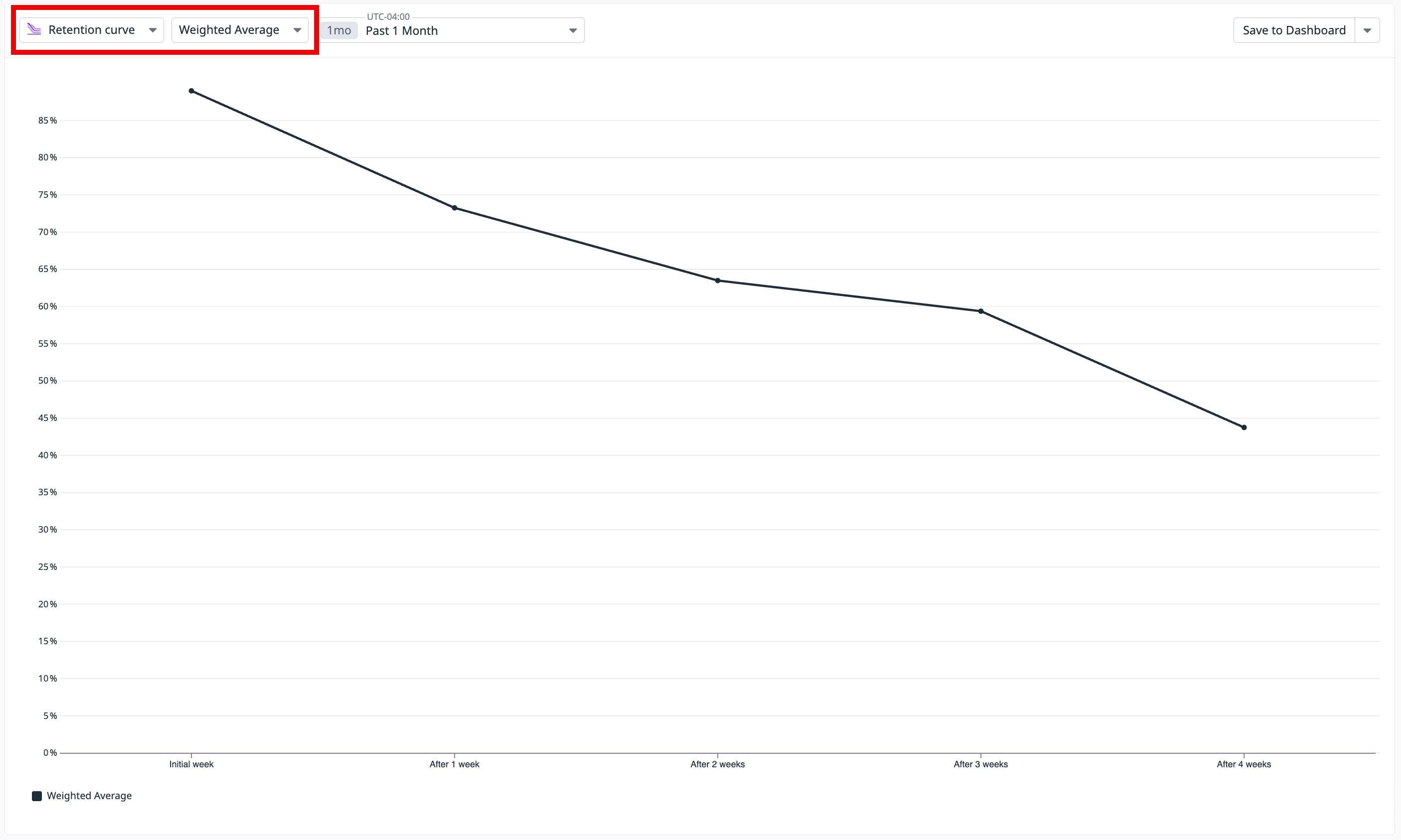
- Retention curve
- Shows the change in retention (including the weighted average) for all or specified cohorts.
- Retention grid
- Displays detailed data on cohorts across time periods.
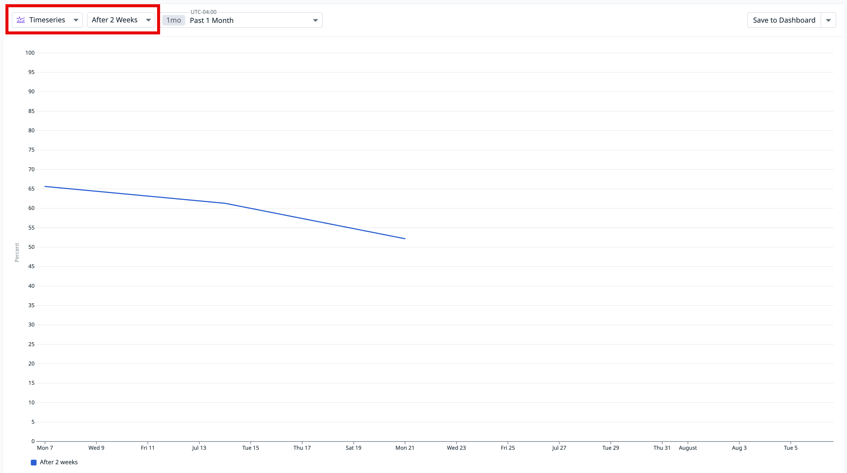
- Timeseries
- Shows the overall retention rate trend over time.
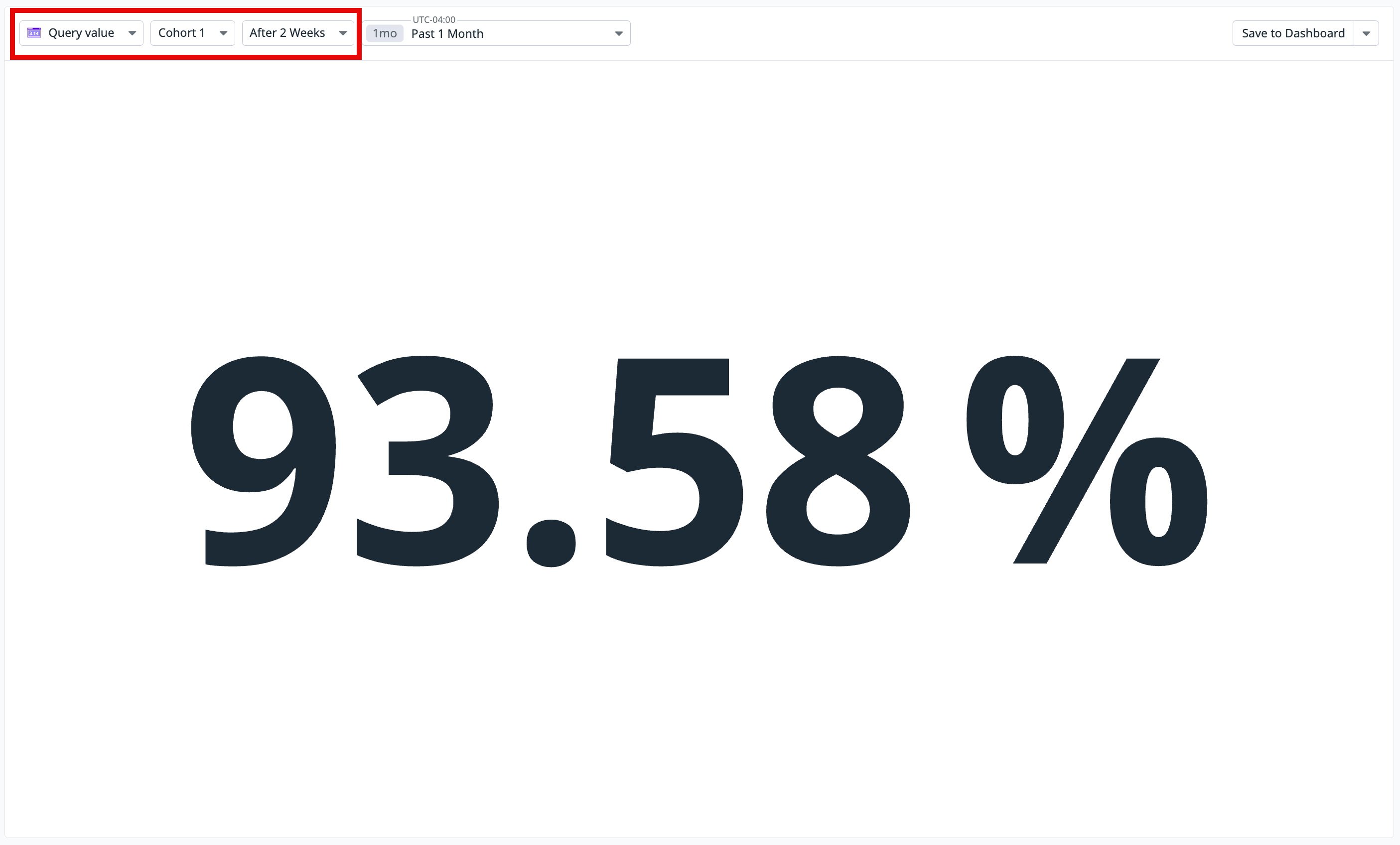
- Query value
- Displays a single value that highlights the retention rate of a time period and cohort.
- Top list
- Shows an ordered ranking of tags by metric.
Further reading
Additional helpful documentation, links, and articles:
real_user_monitoring/application_monitoring

