- Agents
- Essentials
- Getting Started
- Agent
- API
- APM Tracing
- Containers
- Dashboards
- Database Monitoring
- Datadog
- Datadog Site
- DevSecOps
- Incident Management
- Integrations
- Internal Developer Portal
- Logs
- Monitors
- Notebooks
- OpenTelemetry
- Profiler
- Search
- Session Replay
- Security
- Serverless for AWS Lambda
- Software Delivery
- Synthetic Monitoring and Testing
- Tags
- Workflow Automation
- Learning Center
- Support
- Glossary
- Standard Attributes
- Guides
- Agent
- Integrations
- Extend Datadog
- Authorization
- DogStatsD
- Custom Checks
- Integrations
- Build an Integration with Datadog
- Create an Agent-based Integration
- Create an API-based Integration
- Create a Log Pipeline
- Integration Assets Reference
- Build a Marketplace Offering
- Create an Integration Dashboard
- Create a Monitor Template
- Create a Cloud SIEM Detection Rule
- Install Agent Integration Developer Tool
- Service Checks
- Community
- Guides
- OpenTelemetry
- Administrator's Guide
- API
- Partners
- Datadog Mobile App
- DDSQL Reference
- CoScreen
- CoTerm
- Remote Configuration
- Cloudcraft (Standalone)
- In The App
- Dashboards
- Notebooks
- DDSQL Editor
- Reference Tables
- Sheets
- Monitors and Alerting
- Service Level Objectives
- Metrics
- Watchdog
- Bits AI
- Internal Developer Portal
- Error Tracking
- Change Tracking
- Event Management
- Incident Response
- Actions & Remediations
- Infrastructure
- Cloudcraft
- Resource Catalog
- Universal Service Monitoring
- End User Device Monitoring
- Hosts
- Containers
- Processes
- Serverless
- Network Monitoring
- Storage Management
- Cloud Cost
- Application Performance
- APM
- Continuous Profiler
- Database Monitoring
- Agent Integration Overhead
- Setup Architectures
- Setting Up Postgres
- Setting Up MySQL
- Setting Up SQL Server
- Setting Up Oracle
- Setting Up Amazon DocumentDB
- Setting Up MongoDB
- Setting Up ClickHouse
- Connecting DBM and Traces
- Data Collected
- Exploring Database Hosts
- Exploring Query Metrics
- Exploring Query Samples
- Exploring Database Schemas
- Exploring Recommendations
- Troubleshooting
- Guides
- Data Streams Monitoring
- Data Observability
- Digital Experience
- Real User Monitoring
- Synthetic Testing and Monitoring
- Continuous Testing
- Experiments
- Product Analytics
- Session Replay
- Software Delivery
- CI Visibility
- CD Visibility
- Deployment Gates
- Test Optimization
- Code Coverage
- PR Gates
- DORA Metrics
- Feature Flags
- Developer Integrations
- Security
- Security Overview
- Cloud SIEM
- Code Security
- Cloud Security
- App and API Protection
- AI Guard
- Workload Protection
- Sensitive Data Scanner
- AI Observability
- Log Management
- Observability Pipelines
- Configuration
- Sources
- Processors
- Destinations
- Packs
- Akamai CDN
- Amazon CloudFront
- Amazon VPC Flow Logs
- AWS Application Load Balancer Logs
- AWS CloudTrail
- AWS Elastic Load Balancer Logs
- AWS Network Load Balancer Logs
- Cisco ASA
- Cloudflare
- F5
- Fastly
- Fortinet Firewall
- HAProxy Ingress
- Istio Proxy
- Juniper SRX Firewall Traffic Logs
- Netskope
- NGINX
- Okta
- Palo Alto Firewall
- Windows XML
- ZScaler ZIA DNS
- Zscaler ZIA Firewall
- Zscaler ZIA Tunnel
- Zscaler ZIA Web Logs
- Search Syntax
- Scaling and Performance
- Monitoring and Troubleshooting
- Guides and Resources
- Log Management
- CloudPrem
- Administration
Log Visualizations
Overview
Visualizations define how the outcome of filter and aggregates are displayed. Using the logs query editor, select the relevant visualizations to surface crucial information.
Lists
Lists are paginated results of logs or aggregates. They are valuable when individual results matter, but you have no prior or clear knowledge on what defines a matching result. Lists allow you examine a group of results.
Lists displaying individual logs and lists displaying aggregates of logs have slightly different capabilities.
List of logs
For a list of individual logs, choose which information of interest to display as columns. Manage the columns of the table using either:
- The table, with interactions available in the first row. This is the preferred method to sort, rearrange, or remove columns.
- The facet panel on the left, or the log side panel on the right. This is the preferred option to add a column for a field.
With the Options button, control the number of lines displayed in the table per log.
The default sort for logs in the list visualization is by timestamp, with the most recent logs on top. This is the fastest and therefore recommended sorting method for general purposes. Surface logs with lowest or highest value for a measure first, or sort your logs lexicographically for the unique value of facet, ordering a column according to that facet.
Note: Although any attributes or tags can be added as a column, sorting your table is most reliable if you declare a facet beforehand. Non-faceted attributes can be added as columns, but it does not produce reliable sorting.
The configuration of the log table is stored alongside other elements of your troubleshooting context in Saved Views.
List aggregates of logs
The columns displayed in list of aggregates are columns derived from the aggregation.
Results are sorted according to:
- Number of matching events per aggregate for pattern aggregation (default to descending: more to less)
- Lexicographic order of the transaction id for transaction aggregation (default to ascending: A to Z)
Timeseries
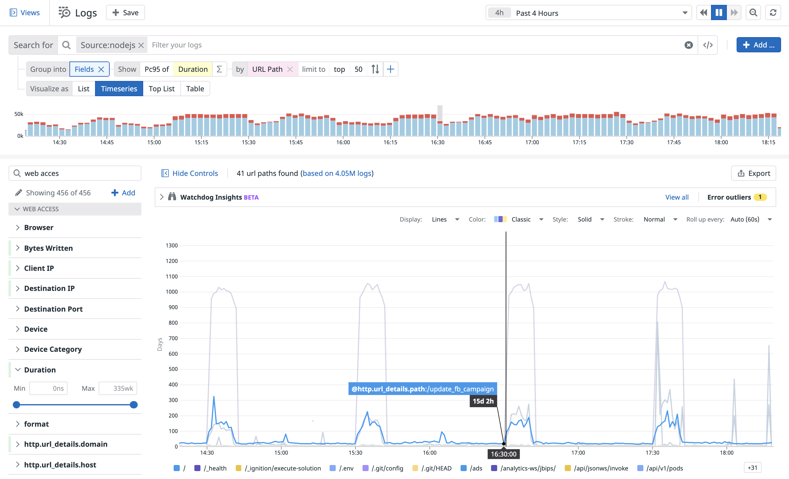
Visualize the evolution of a single measure (or a facet unique count of values) over a selected time frame, and (optionally) split by up to three available facets.
The following Timeseries log analytics shows the evolution of the top 50 URL Paths according to the 95th percentile of duration over the last 15 minutes.
Choose additional display options for timeseries: the roll-up interval, whether you display results as bars (recommended for counts and unique counts), lines (recommended for statistical aggregations) or areas, and the colorset.
Top list
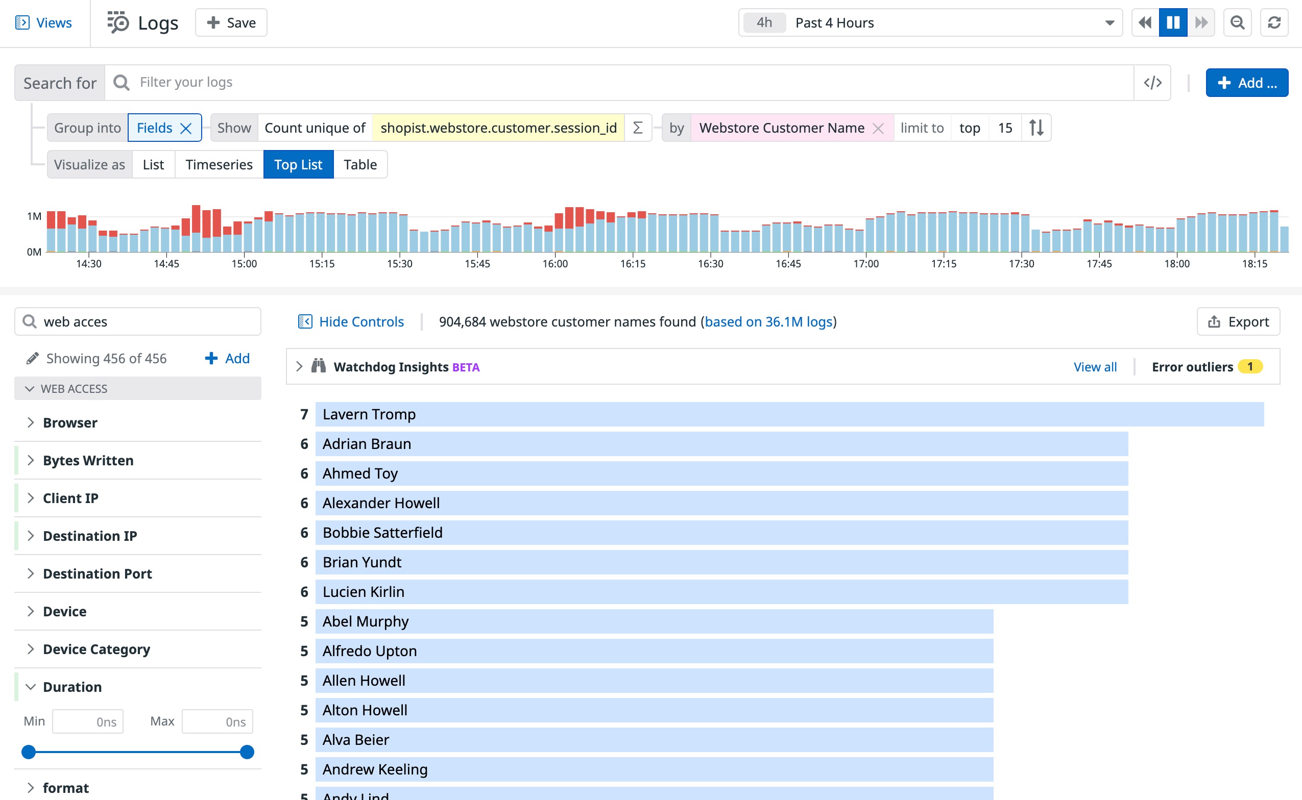
Visualize the top values from a facet according to the chosen measure.
For example, the following top list shows the top 15 Customers on a merchant website according to the number of unique sessions they had over the last day.
Nested tables
Visualize the top values from up to three facets according to a chosen measure (the first measure you choose in the list), and display the value of additional measures for elements appearing in this table. Update a search query or examine the logs corresponding to either dimension.
- When there are multiple measures, the top or bottom list is determined according to the first measure.
- The subtotal may differ from the actual sum of values in a group, since only a subset (top or bottom) is displayed. Events with a null or empty value for this dimension are not displayed as a sub-group.
Note: A table visualization used for one single measure and one single dimension is the same as a Toplist, just with a different display.
The following table log analytics show the evolution of the Top 10 Availability zones, and for each Availability Zone the Top 10 Versions according to their number or error logs, along with the number of unique count of Hosts and Container ID for each.
Pie chart
A pie chart helps you organize and show data as a percentage of a whole. It is useful when comparing the relationship between different dimensions such as services, users, hosts, countries, etc. within your log data.
The following pie chart shows the percentage breakdown by service.
Tree map
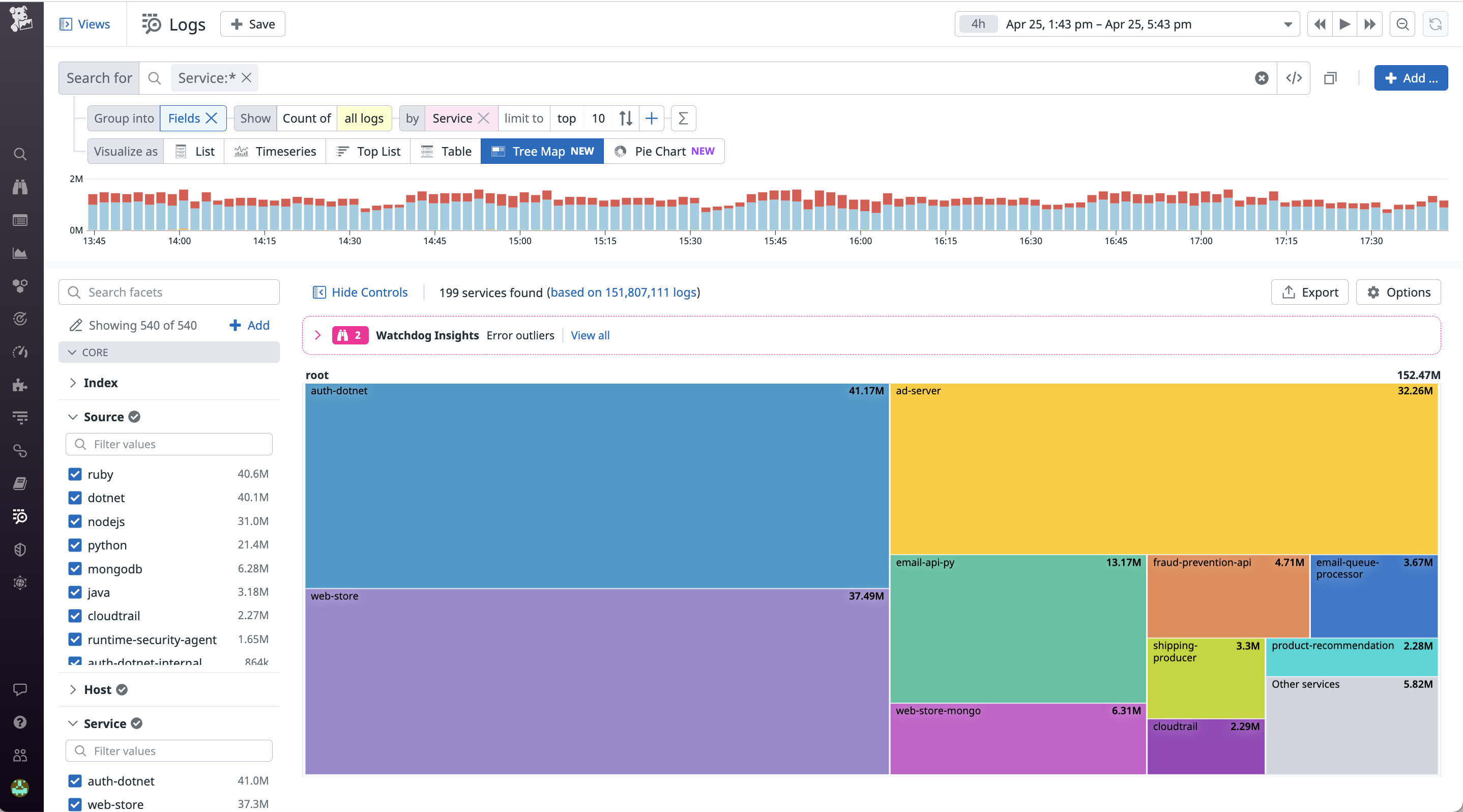
A tree map helps you organize and show data as a percentage of a whole in a visually appealing format. Tree maps display data in nested rectangles. Compare different dimensions using both size and colors of the rectangles. You can also select multiple attributes to view a hierarchy of rectangles.
The following tree map shows the percentage breakdown by service.
Additional helpful documentation, links, and articles:


