- Agents
- Essentials
- Getting Started
- Agent
- API
- APM Tracing
- Containers
- Dashboards
- Database Monitoring
- Datadog
- Datadog Site
- DevSecOps
- Incident Management
- Integrations
- Internal Developer Portal
- Logs
- Monitors
- Notebooks
- OpenTelemetry
- Profiler
- Search
- Session Replay
- Security
- Serverless for AWS Lambda
- Software Delivery
- Synthetic Monitoring and Testing
- Tags
- Workflow Automation
- Learning Center
- Support
- Glossary
- Standard Attributes
- Guides
- Agent
- Integrations
- Extend Datadog
- Authorization
- DogStatsD
- Custom Checks
- Integrations
- Build an Integration with Datadog
- Create an Agent-based Integration
- Create an API-based Integration
- Create a Log Pipeline
- Integration Assets Reference
- Build a Marketplace Offering
- Create an Integration Dashboard
- Create a Monitor Template
- Create a Cloud SIEM Detection Rule
- Install Agent Integration Developer Tool
- Service Checks
- Community
- Guides
- OpenTelemetry
- Administrator's Guide
- API
- Partners
- Datadog Mobile App
- DDSQL Reference
- CoScreen
- CoTerm
- Remote Configuration
- Cloudcraft (Standalone)
- In The App
- Dashboards
- Notebooks
- DDSQL Editor
- Reference Tables
- Sheets
- Monitors and Alerting
- Service Level Objectives
- Metrics
- Watchdog
- Bits AI
- Internal Developer Portal
- Error Tracking
- Change Tracking
- Event Management
- Incident Response
- Actions & Remediations
- Infrastructure
- Cloudcraft
- Resource Catalog
- Universal Service Monitoring
- End User Device Monitoring
- Hosts
- Containers
- Processes
- Serverless
- Network Monitoring
- Storage Management
- Cloud Cost
- Application Performance
- APM
- Continuous Profiler
- Database Monitoring
- Agent Integration Overhead
- Setup Architectures
- Setting Up Postgres
- Setting Up MySQL
- Setting Up SQL Server
- Setting Up Oracle
- Setting Up Amazon DocumentDB
- Setting Up MongoDB
- Setting Up ClickHouse
- Connecting DBM and Traces
- Data Collected
- Exploring Database Hosts
- Exploring Query Metrics
- Exploring Query Samples
- Exploring Database Schemas
- Exploring Recommendations
- Troubleshooting
- Guides
- Data Streams Monitoring
- Data Observability
- Digital Experience
- Real User Monitoring
- Synthetic Testing and Monitoring
- Continuous Testing
- Experiments
- Product Analytics
- Session Replay
- Software Delivery
- CI Visibility
- CD Visibility
- Deployment Gates
- Test Optimization
- Code Coverage
- PR Gates
- DORA Metrics
- Feature Flags
- Developer Integrations
- Security
- Security Overview
- Cloud SIEM
- Code Security
- Cloud Security
- App and API Protection
- AI Guard
- Workload Protection
- Sensitive Data Scanner
- AI Observability
- Log Management
- Observability Pipelines
- Configuration
- Sources
- Processors
- Destinations
- Packs
- Akamai CDN
- Amazon CloudFront
- Amazon VPC Flow Logs
- AWS Application Load Balancer Logs
- AWS CloudTrail
- AWS Elastic Load Balancer Logs
- AWS Network Load Balancer Logs
- Cisco ASA
- Cloudflare
- F5
- Fastly
- Fortinet Firewall
- HAProxy Ingress
- Istio Proxy
- Juniper SRX Firewall Traffic Logs
- Netskope
- NGINX
- Okta
- Palo Alto Firewall
- Windows XML
- ZScaler ZIA DNS
- Zscaler ZIA Firewall
- Zscaler ZIA Tunnel
- Zscaler ZIA Web Logs
- Search Syntax
- Scaling and Performance
- Monitoring and Troubleshooting
- Guides and Resources
- Log Management
- CloudPrem
- Administration
Trace Cluster Map
This product is not supported for your selected Datadog site. ().
Overview
You can identify drifts in your LLM applications by visualizing trace data in clusters on the Clusters page. Select an application configured with LLM Observability to view cluster information.
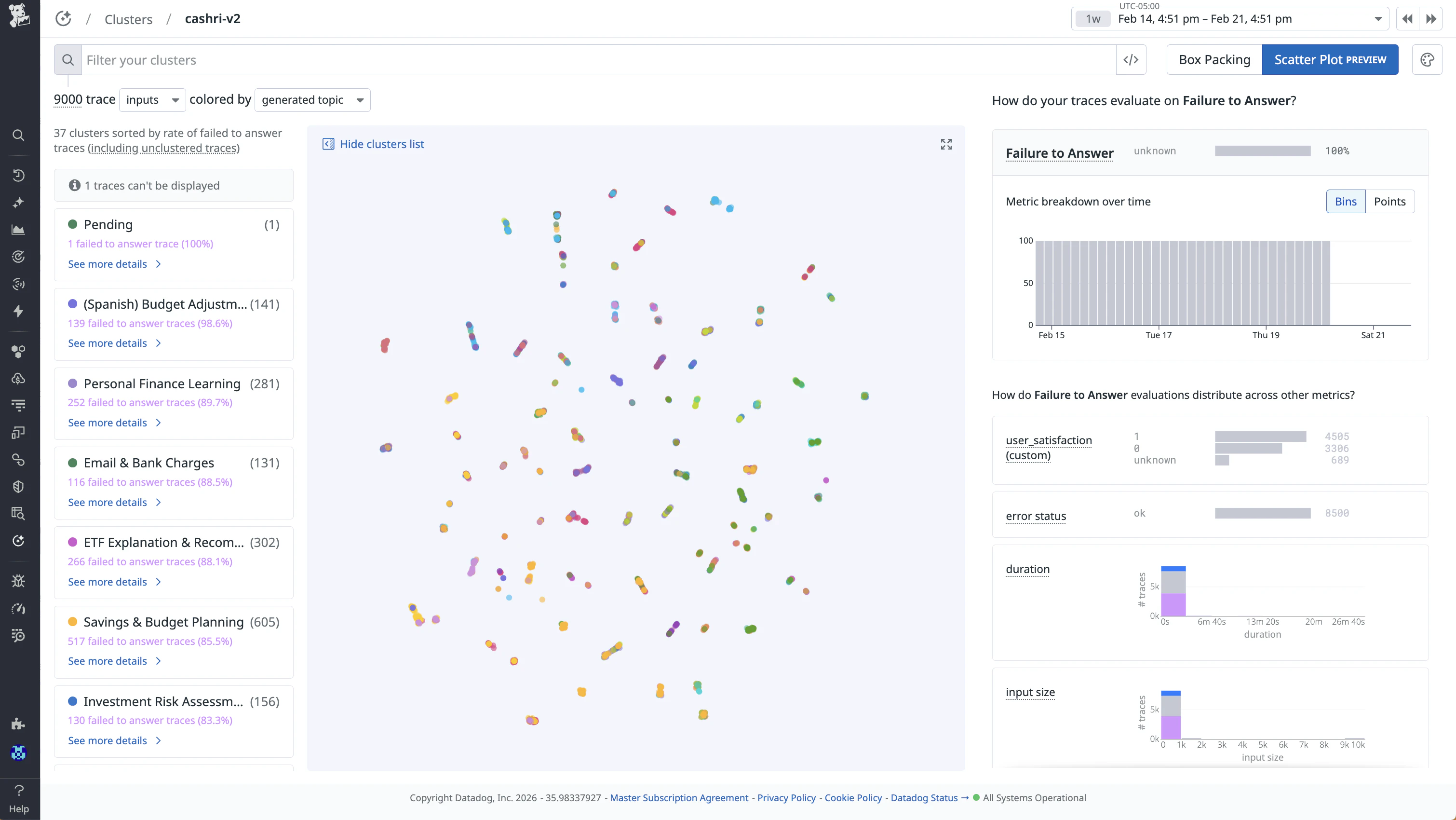
Note: Clustering can take up to 24 hours after data is ingested to be fully processed and visible on the Cluster Map. During this time, spans that are not yet clustered appear under a “Pending” cluster.
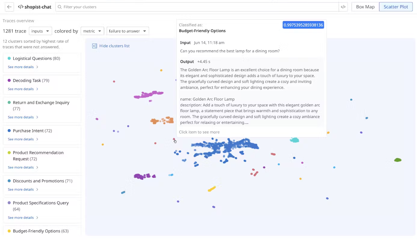
Cluster Maps display inputs or outputs, grouped by topic. Inputs and outputs are clustered separately. Topics are determined by clustering the selected input or output into text embeddings in high dimensions, then projecting them into a 2D space.
You can visualize the clusters by using a Box Packing or Scatter Plot layout.
- Box Packing gives you a grouped view of each of the clusters and overlays any metrics or evaluations on every trace.
- Scatter Plot, on the other hand, allows you to view the high dimensional text embeddings in a 2D space, although the distance between each trace may be misleading due to projection distortion.
Cluster Maps provide an overview of each cluster’s performance across operational metrics, such as error types and latency, or out-of-the-box or custom evaluations, enabling you to identify trends such as topic drift and additional quality issues.
Built with Llama: The Cluster Map uses Llama to generate topic labels based on your instrumented LLM application's inputs and outputs.
Search and manage clusters
Customize your search query by selecting the sorting options to narrow down the clusters based on your specific criteria, such as evaluation metrics or time periods, for more targeted analysis.
- Select
inputsoroutputsfrom the dropdown menu to see clusters for inputs or outputs grouped by topic. - Select an evaluation type or an evaluation score to color-code the clusters. For example,
Output Sentimentfor “What is the sentiment of the output?” ordurationfor “How long does it take for an LLM to generate an output (in nanoseconds)?” - Select a field for the clusters to be sorted by: time, duration, or color. Then, select desc or asc to set the order.
Select a topic cluster from the list to examine how inputs or outputs about specific topics perform against other topics for each metric or evaluation. You can also see individual prompts and responses for each cluster. For example, you can get an overview of your slowest topics when you overlay by duration.
Further Reading
Additional helpful documentation, links, and articles:


