- 重要な情報
- はじめに
- 用語集
- Standard Attributes
- ガイド
- インテグレーション
- エージェント
- OpenTelemetry
- 開発者
- Administrator's Guide
- API
- Partners
- DDSQL Reference
- モバイルアプリケーション
- CoScreen
- CoTerm
- Remote Configuration
- Cloudcraft
- アプリ内
- ダッシュボード
- ノートブック
- DDSQL Editor
- Reference Tables
- Sheets
- Watchdog
- アラート設定
- メトリクス
- Bits AI
- Internal Developer Portal
- Error Tracking
- Change Tracking
- Service Management
- Actions & Remediations
- インフラストラクチャー
- Cloudcraft
- Resource Catalog
- ユニバーサル サービス モニタリング
- Hosts
- コンテナ
- Processes
- サーバーレス
- ネットワークモニタリング
- Cloud Cost
- アプリケーションパフォーマンス
- APM
- Continuous Profiler
- データベース モニタリング
- Data Streams Monitoring
- Data Jobs Monitoring
- Data Observability
- Digital Experience
- RUM & セッションリプレイ
- Synthetic モニタリング
- Continuous Testing
- Product Analytics
- Software Delivery
- CI Visibility (CI/CDの可視化)
- CD Visibility
- Deployment Gates
- Test Visibility
- Code Coverage
- Quality Gates
- DORA Metrics
- Feature Flags
- セキュリティ
- セキュリティの概要
- Cloud SIEM
- Code Security
- クラウド セキュリティ マネジメント
- Application Security Management
- Workload Protection
- Sensitive Data Scanner
- AI Observability
- ログ管理
- Observability Pipelines(観測データの制御)
- ログ管理
- CloudPrem
- 管理
Monitor History and Evaluation Graphs
このページは日本語には対応しておりません。随時翻訳に取り組んでいます。
翻訳に関してご質問やご意見ございましたら、お気軽にご連絡ください。
翻訳に関してご質問やご意見ございましたら、お気軽にご連絡ください。
Overview
The Monitor Status page contains two graphs, the History Graph and Evaluation Graph, that provide insight into monitor evaluations. This guide covers:
- Defining the history graph and evaluation graph
- Which values the two graphs display
- Replicating the Evaluation Graph result outside of a monitor
Evaluation vs. History graph
- History Graph
- Shows the raw data points being submitted for the monitor query. The monitor status page uses the same graph widget in notebooks and dashboards.
- Evaluation Graph
- Shows results from the raw data points of a metric applied against the user defined alert conditions. This graph’s data have been aggregated and reduced due to the evaluation window, so the query results are similar to the query value widget for each data point.
When you submit your raw data points to Datadog for monitoring, this information is visualized in the history graph. For example, you have the following data points over the past 5 minutes: [10, 15, 12, 8, 11]. The history graph shows each value.
When you configure your evaluation of the query, this adds another aggregation to the metric values for your monitor to alert on. For example, you configure your monitor to evaluate the average over the past 5 minutes. The evaluation graph shows the value of 11.2 as a single data point.
(10+15+12+8+11)/5 = 11.2
Why are the graphs different?
Typically, the two graphs are not visualizing the same data point values. In addition, multiple other factors can contribute to the differences in the visualization graphs.
as_count() metrics
Queries with as_count metrics in the formula, use a different evaluation path. The evaluation applies any aggregation before the formula. For example if you are using A / B and both are using the as_count evaluation path, it would be evaluated as:
(1+2+3+4+5) / (10+10+10+10+10)
For more information, see the as_count() in Monitor Evaluations guide.
Using formulas
When using formulas, monitors apply the aggregation function for the monitor evaluation on the formula, not the individual queries. This means, if you are using the AVG (avg by) aggregation function on your queries, but are using SUM (sum by) over the past X minutes in your evaluation configuration, then the edit page/history graph values do not match the values of the evaluation graph. For an example, see the troubleshooting section.
Evaluation delay
When using an evaluation delay, the evaluation graph does not match the timing of the history graph one for one. For example, if you add a 5 minute evaluation delay, you need to look at the data point in the history graph from 5 minutes before to correlate it to the evaluation graph.
Metric aggregation method
You can see different results depending on the aggregation method you are using in your query and your evaluation aggregation. The History and Edit Page use the aggregation methods from your queries while the Evaluation Graph uses the aggregation method determined by the Evaluate the option.
Depending on the aggregation method you are choosing in your monitor setup, this can show a different value compared to what you are seeing on the edit page. For example, if your monitor queries are using AVG but you are looking to alert on the MINIMUM value over the last X minutes/hours, then the evaluation graph shows the MIN value while your history/edit page graphs shows the AVG values. This is because the monitor is alerting on the aggregation method set in the monitor evaluation, not the aggregation method set in the metric query.
Troubleshooting evaluation graph values
You can visualize what the monitor is evaluating at a specific time point by using a Notebook Query Value Widget. Take the query in your monitor (with any formulas or functions) and then set your time frame for the graph to your evaluation window. This shows the data as it is aggregated to one single point.
In the following example, take a time frame from the Evaluation graph you want to investigate. Hover over the evaluation graph data point to see the value and the time. For example, you want to investigate why your evaluation graph shows a data point of 0.38 at 10:50:35, when your history graph shows 0.26 around the same time.
To troubleshoot this value you can open the monitor edit page and transfer the monitor configuration to a Notebook Query Value widget.
Monitor edit page configuration fields:
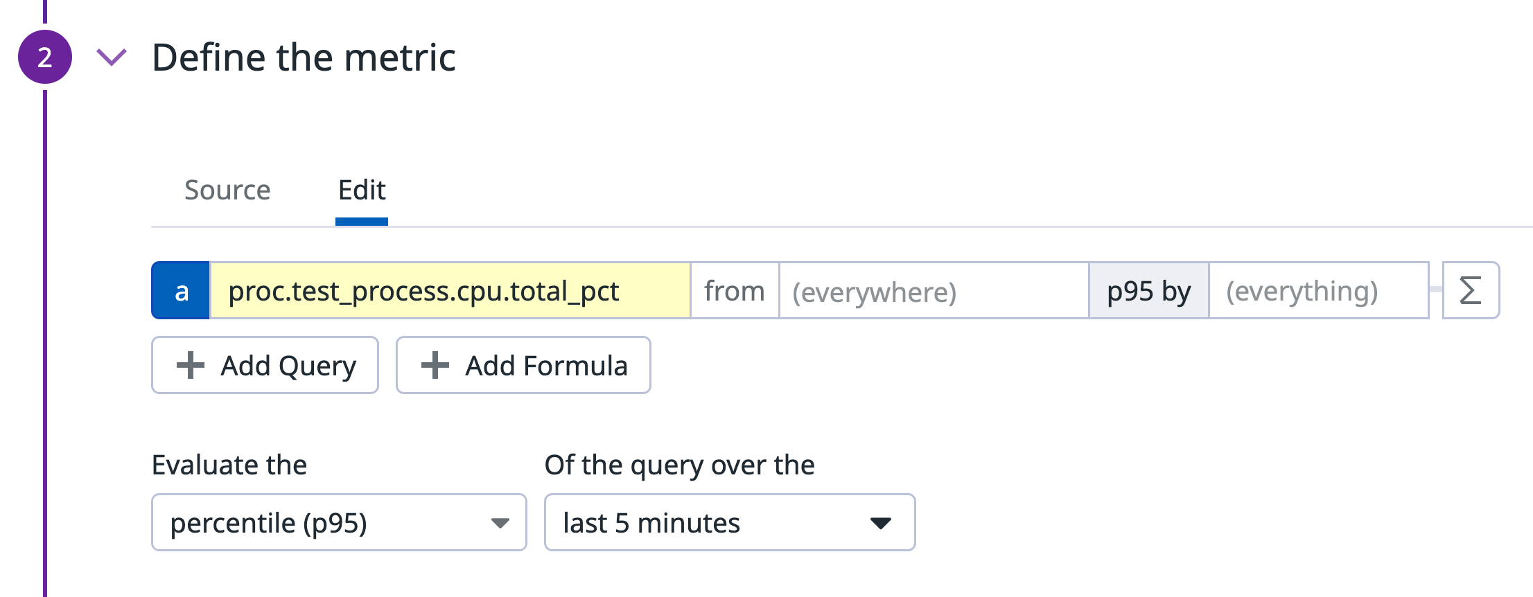
- Metric Query a:
proc.test_process.cpu.total_pctp95 by (everything) - Monitor evaluation aggregation: Evaluate the
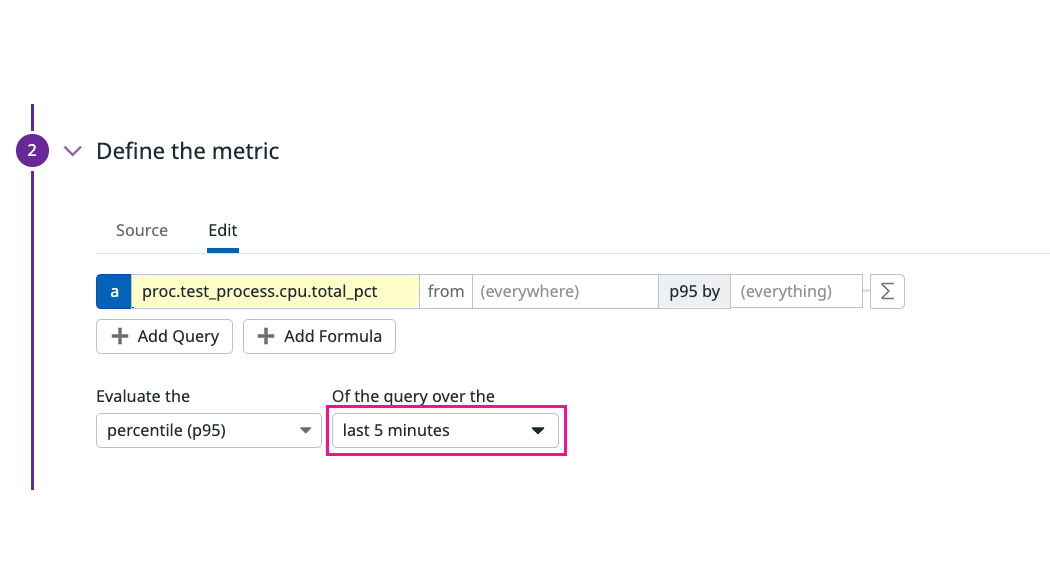
percentile (p95)of the query - Monitor evaluation window: the
last 5 minutes
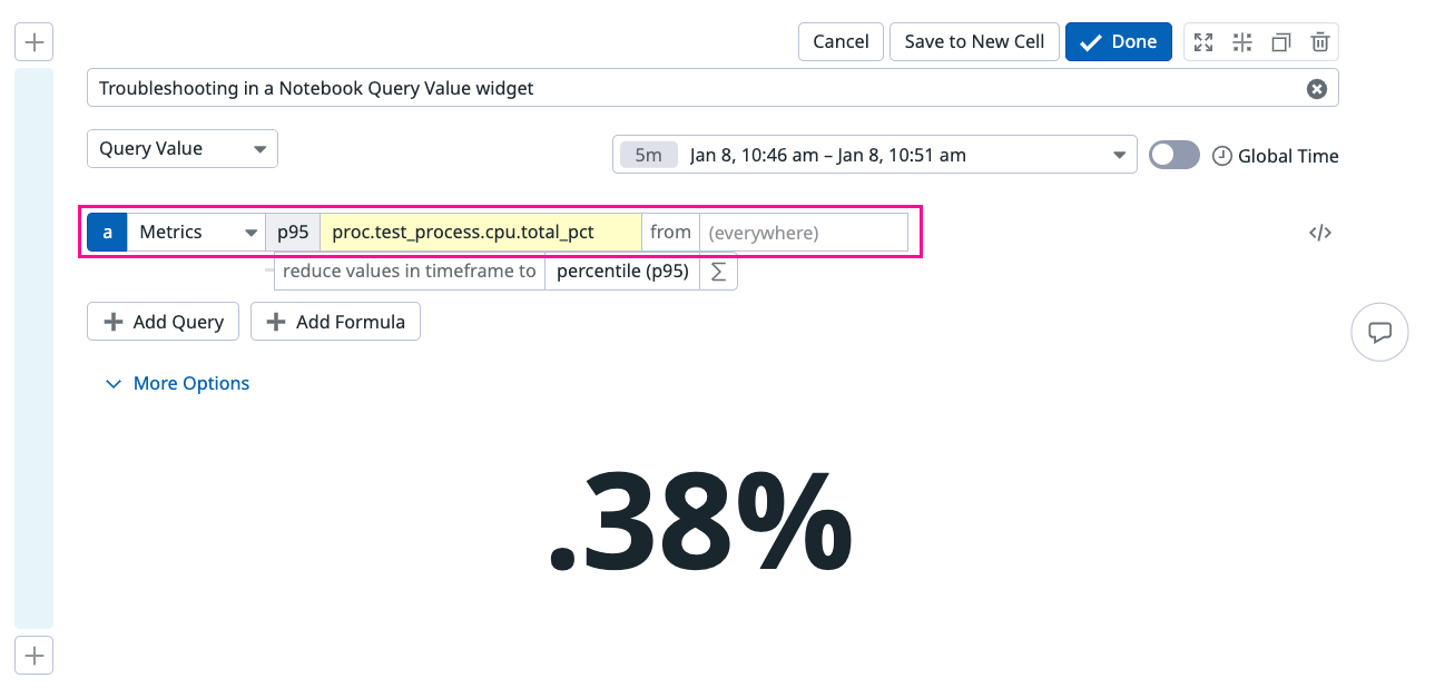
Transfer the same configuration to the Notebook Query Value widget.
- The widget dropdown should display Query Value.
- Select the timeframe corresponding to the data point you are troubleshooting.
- Input the metric query from your monitor configuration:
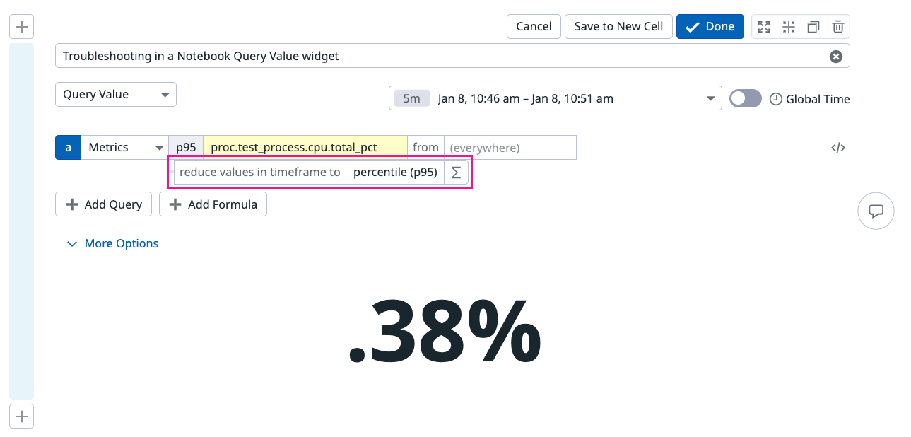
proc.test_process.cpu.total_pct. Add the metric aggregationp95 by. - Verify the evaluation matches the monitor evaluation,
percentile (p95). - Verify the query value matches the evaluation data point in your monitor.
| Configuration | Monitor | Query Value widget |
|---|---|---|
| Metric Query | ||
| Monitor Aggregation | ||
| Evaluation Window |
Troubleshooting an evaluation graph with formulas
In this example, troubleshoot a value in the monitor evaluation graph with multiple queries and a formula, in a Notebook Query Value widget. On the evaluation graph, hover over the data point you want to investigate, in this example, you want to troubleshoot the evaluation graph value of 9.17 at 13:55:29.
Monitor edit page configuration fields:
- Metric Query a:
proc.test_process.cpu.total_pctavg by (everything) - Metric Query b:
system.cpu.useravg by (everything) - Monitor evaluation aggregation: Evaluate the
minof the query - Monitor evaluation window: the
last 5 minutes
Transfer the same configuration to the Notebook Query Value widget one metric at a time.
Metric a
- The widget dropdown should display Query Value.
- Select the timeframe corresponding to 5 minutes around 13:55:29. In this case, 13:50 - 13:55 (1:50 - 1:55).
- Input the metric query from your monitor configuration:
proc.test_process.cpu.total_pct. Add the metric aggregationavg.
Metric b
- The widget dropdown should display Query Value.
- Select the timeframe corresponding to 5 minutes around 13:55:29. In this case, 13:50 - 13:55 (1:50 - 1:55).
- Input the metric query from your monitor configuration:
system.cpu.user. Add the metric aggregationavg.
The monitor evaluation Min takes the minimum value of the queries over the past 5 minutes.


