- Agents
- Essentials
- Getting Started
- Agent
- API
- APM Tracing
- Containers
- Dashboards
- Database Monitoring
- Datadog
- Datadog Site
- DevSecOps
- Incident Management
- Integrations
- Internal Developer Portal
- Logs
- Monitors
- Notebooks
- OpenTelemetry
- Profiler
- Search
- Session Replay
- Security
- Serverless for AWS Lambda
- Software Delivery
- Synthetic Monitoring and Testing
- Tags
- Workflow Automation
- Learning Center
- Support
- Glossary
- Standard Attributes
- Guides
- Agent
- Integrations
- Extend Datadog
- Authorization
- DogStatsD
- Custom Checks
- Integrations
- Build an Integration with Datadog
- Create an Agent-based Integration
- Create an API-based Integration
- Create a Log Pipeline
- Integration Assets Reference
- Build a Marketplace Offering
- Create an Integration Dashboard
- Create a Monitor Template
- Create a Cloud SIEM Detection Rule
- Install Agent Integration Developer Tool
- Service Checks
- Community
- Guides
- OpenTelemetry
- Administrator's Guide
- API
- Partners
- Datadog Mobile App
- DDSQL Reference
- CoScreen
- CoTerm
- Remote Configuration
- Cloudcraft (Standalone)
- In The App
- Dashboards
- Notebooks
- DDSQL Editor
- Reference Tables
- Sheets
- Monitors and Alerting
- Service Level Objectives
- Metrics
- Watchdog
- Bits AI
- Internal Developer Portal
- Error Tracking
- Change Tracking
- Event Management
- Incident Response
- Actions & Remediations
- Infrastructure
- Cloudcraft
- Resource Catalog
- Universal Service Monitoring
- End User Device Monitoring
- Hosts
- Containers
- Processes
- Serverless
- Network Monitoring
- Storage Management
- Cloud Cost
- Application Performance
- APM
- Continuous Profiler
- Database Monitoring
- Agent Integration Overhead
- Setup Architectures
- Setting Up Postgres
- Setting Up MySQL
- Setting Up SQL Server
- Setting Up Oracle
- Setting Up Amazon DocumentDB
- Setting Up MongoDB
- Setting Up ClickHouse
- Connecting DBM and Traces
- Data Collected
- Exploring Database Hosts
- Exploring Query Metrics
- Exploring Query Samples
- Exploring Database Schemas
- Exploring Recommendations
- Troubleshooting
- Guides
- Data Streams Monitoring
- Data Observability
- Digital Experience
- Real User Monitoring
- Synthetic Testing and Monitoring
- Continuous Testing
- Experiments
- Product Analytics
- Session Replay
- Software Delivery
- CI Visibility
- CD Visibility
- Deployment Gates
- Test Optimization
- Code Coverage
- PR Gates
- DORA Metrics
- Feature Flags
- Developer Integrations
- Security
- Security Overview
- Cloud SIEM
- Code Security
- Cloud Security
- App and API Protection
- AI Guard
- Workload Protection
- Sensitive Data Scanner
- AI Observability
- Log Management
- Observability Pipelines
- Configuration
- Sources
- Processors
- Destinations
- Packs
- Akamai CDN
- Amazon CloudFront
- Amazon VPC Flow Logs
- AWS Application Load Balancer Logs
- AWS CloudTrail
- AWS Elastic Load Balancer Logs
- AWS Network Load Balancer Logs
- Cisco ASA
- Cloudflare
- F5
- Fastly
- Fortinet Firewall
- HAProxy Ingress
- Istio Proxy
- Juniper SRX Firewall Traffic Logs
- Netskope
- NGINX
- Okta
- Palo Alto Firewall
- Windows XML
- ZScaler ZIA DNS
- Zscaler ZIA Firewall
- Zscaler ZIA Tunnel
- Zscaler ZIA Web Logs
- Search Syntax
- Scaling and Performance
- Monitoring and Troubleshooting
- Guides and Resources
- Log Management
- CloudPrem
- Administration
- Account Management
- Data Security
- Help
Host Map
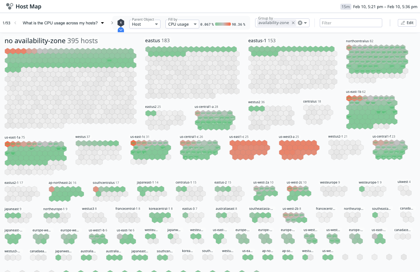
Datadog’s Host Map visualizes your hosts, pods, containers, and clusters, helping you to understand and diagnose your infrastructure.
Usage
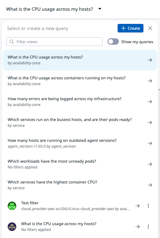
Use the drop-down in the upper left to view suggested queries, or the saved custom queries written by you or someone else in your organization. To write a custom query, click Create.
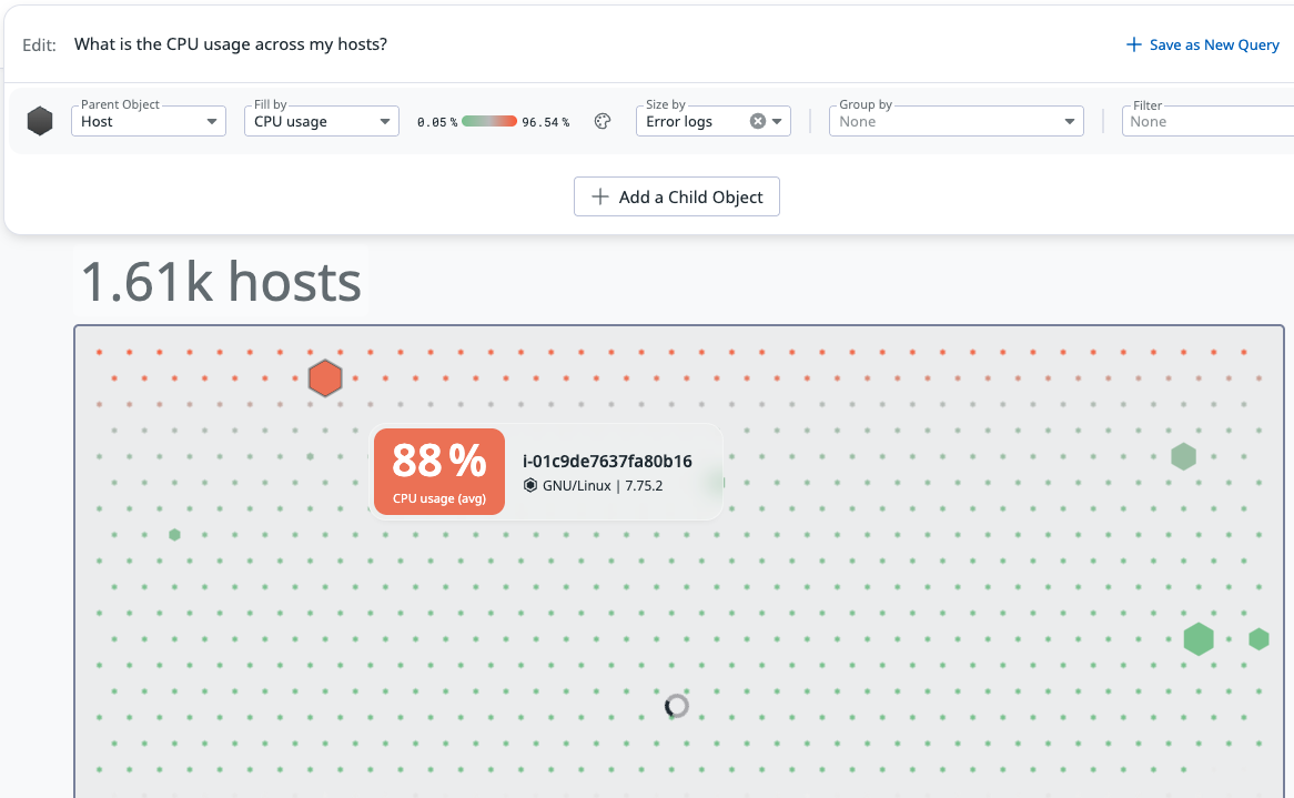
Parent/Child Object: Select resources (Host, Pod, Container, Cluster) to view. Parent and Child objects have hierarchical relationships.
Fill by: By default, the color of each object represents CPU usage, where the color ranges from green (0% utilized) to orange (100% utilized). Use the Fill by drop-down to color your objects by various metrics or signals, such as memory or error logs.
Size by: If you do not specify a Child object, you can use the Size by selector to size each object by a metric or signal.
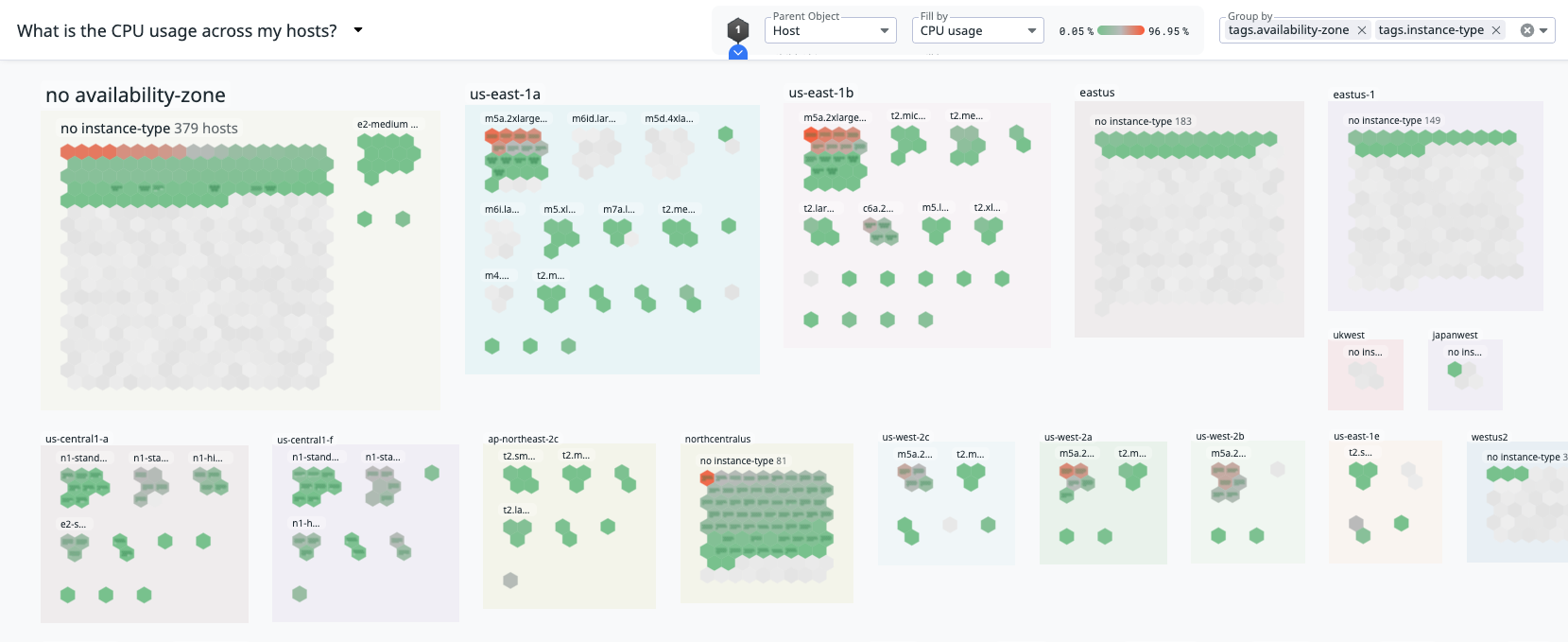
Group by: Spatially arrange your objects into groups. You can use multiple groupings. For example, if you group by
tags.availability-zonetags.instance-type, your objects are first arranged by availability zone and then further subdivided by instance type.Filter: Limit the Host Map to a specific subset of your infrastructure. For example, you can filter by
productionto only view your production resources. The Filter input supports logical operators (AND,NOT,OR) and wildcards (*). For example:(tags.availability-zone:ap* OR tags.availability-zone:eu*) NOT tags.agent_version:5.3*.
Use cases
Troubleshoot degraded server performance
Identify whether performance issues stem from overloaded hosts, unhealthy pods, container restarts, or cluster-level bottlenecks. Check for kubernetes_state.pod.status:unready or system.cpu.user > 80 and use hierarchical views to isolate the root cause.
Identify cost hotspots
Identify clusters, nodes, or workloads contributing disproportionately to cloud spend by querying tags like tags.kube_node_instance_type, tags.cloud_provider, or custom allocation tags. Combine this with container/host CPU and memory signals to detect under- or over-provisioning.
Fleet-wide Datadog Agent management
Find hosts or containers running outdated Datadog Agent versions using queries like tags.agent_version < 7.50. Then group by availability zone, cluster, or service to drive rollout planning.
Monitor Kubernetes rollouts or infrastructure migrations
Visualize the distribution and health of pods, nodes, and clusters during a deployment or migration. View your clusters, nested with pods, and watch changes in real time to detect regressions.
Verify tagging and metadata hygiene
Use logical operators to validate whether your hosts and pods are correctly tagged for ownership, environment, region, or cost allocation. For example, tags.env:prod AND NOT (tags.team:*) to surface unowned or improperly tagged resources.
Further Reading
Additional helpful documentation, links, and articles:


